yuni yoshida
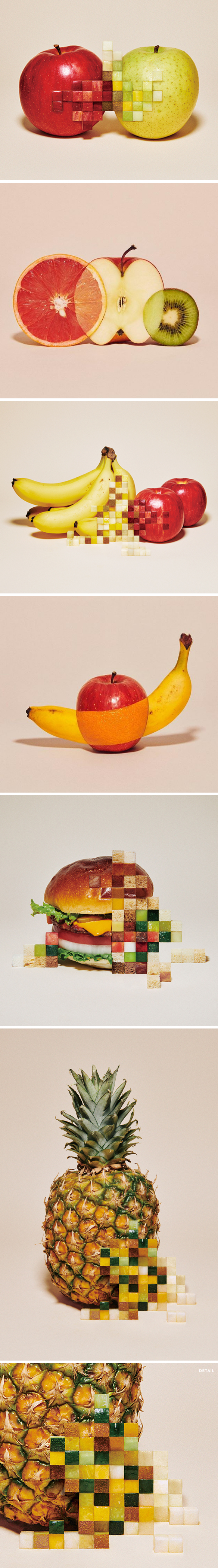
WHAT. Yep. This is the work of Japanese artist, designer, art director Yuni Yoshida. Her portfolio scrolls on forever and is filled with one clever project after another, but this food… oh, this brilliantly sliced and diced food… yum, on so many levels! Happy Friday.
amy bennett

Yep, you always have to look a little closer when enjoying the work of American painter Amy Bennett… what seems like a lovely, quiet, small town scene often has a little something extra going on, just begging the viewer to build a narrative in their own minds. Honestly, as a lover of mysteries, I kind of wish each of her paintings came with an in-depth ’20/20′ episode so I could really get to the bottom of things. Her latest solo show opens TODAY, July 11 from 6-8pm at Miles McEnery Gallery {520 West 21st Street, NYC} and runs until August 16, 2019.
emmanuelle moureaux

Okay, now this is my kind of math! “Forest of Numbers” (2017) is the work of Emmanuelle Moureaux, a French architect living in Tokyo. This is just one of many absolutely breathtaking, colorful, all-consuming installations she has created. Emmanuelle is “inspired by the layers and colors of Tokyo that built a complex depth and density on the street, and the Japanese traditional spatial elements like sliding screens, she has created the concept of shikiri, which literally means ‘dividing (creating) space with colors’.” Well, that is exactly what she did with this 2017 installation at The National Art Center, Tokyo. Here is the description from her site:
“The installation “Forest of Numbers” (2017) visualized the decade of the future from 2017 to 2026, created a sense of stillness across the large exhibition space. More than 60,000 pieces of suspended numeral figures from 0 to 9 were regularly aligned in three dimensional grids. A section was removed, created a path that cut through the installation, invited visitors to wonder inside the colorful forest filled with numbers. The installation was composed of 10 layers which is the representation of 10 years time. Each layer employed 4 digits to express the relevant year such as 2, 0, 1, and 7 for 2017, which were randomly positioned on the grids. As part of Emmanuelle’s “100 colors” installation series, the layers of time were colored in 100 shades of colors, created a colorful time travel through the forest.
Inside the colorful forest, two girls and one cat were lost inside, added playfulness to the installation. In concert with the installation, the compilation of exhibition posters from the last ten years filled the wall on the right, and the opposite wall across the room simply expressed the next ten years with white numbers. Because photography was exceptionally allowed, the installation has spread through various social networks, increasing number of visitors. This installation was created with the cooperation of 300 volunteers, excited the attention of over 20,000 visitors in 10 days.”
Ahhh, to be lost in a rainbow-hued forest of numbers, searching for that little pink cat. Stunning.
naomi zouwer

Gasp! As a lover of small, collected, special treasures this wall-mounted mandala, made up of 84 pieces of loveliness {oil on board}, is calling my name! This work, titled “The Under Glow”, is just one of the many reasons I love the very personal work of Australian artist Naomi Zouwer {including object “portraits” of her family}. Her portfolio is filled to the brim with beautifully painted keepsakes, which on their own might seem trivial, but together? Well, they become their own beautiful language.
[Naomi] focuses on small domestic objects that are part of daily life. They are a mixture of functional and non-functional items; precious in terms of memories, they are keepsakes, souvenirs, some are whole and some just fragments. Zouwer’s painting of objects enhances their quality and raises their status so that they become worthy of sustained attention.
Love.
devra freelander
“Fluorescent Fragments” … I loved this joyful, vibrant installation the second I saw it, but now these broken shards feel different. This is the work of American artist Devra Freelander. On July 1, 2019, at the very young age of 28, Devra was hit and killed by a truck while riding her bike in Brooklyn. Heartbreaking and senseless. This is the long list of artistic accomplishments Devra had already achieved. It is a terrible tragedy that she can no longer add to this:
Devra Freelander makes sculptures and videos that explore climate change and geology from an ecofeminist and millennial lens. She received her MFA in Sculpture from Rhode Island School of Design in 2016, and her BA with honors in Studio Art from Oberlin College in 2012. Freelander has exhibited with Times Square Arts, CRUSH Curatorial, SPRING/BREAK Art Show, the Affordable Art Fair, the New York Design Center, the RISD Museum, Zoya Tommy Contemporary, the White Gallery, and the Fjuk Arts Centre. She is a founding member of MATERIAL GIRLS, and a recipient of the 2016 St. Botolph Club Foundation Emerging Artist Award. She has participated in residencies with Sculpture Space (Utica, NY April-May 2019) Women’s Studio Workshop (Rosendale, NY November-December 2018), the Arctic Circle Residency (Svalbard, Norway, October 2017), Socrates Sculpture Park (Long Island City, NY, 2017), Lower Manhattan Cultural Council Workspace (New York, NY 2016-2017), the Fjuk Arts Centre (Husavik, Iceland, July 2015), and Virginia Commonwealth University Summer Studio Program (Richmond, VA, June-August 2013). She is represented by CIRCA Gallery in Minneapolis, MN.
All of my love to her friends and family. RIP, Devra.

melissa mcgill

“Red Regatta is a non-profit independent public art project, presented in collaboration with Associazione Vela al Terzo, that unites Venetians and visitors to celebrate the cultural and maritime history of this iconic city to call attention to the forces of climate change and mass tourism that threaten its future.” YES! This is the latest breathtaking work of New York based artist Melissa McGill. This stunning project fills Venice’s lagoon and canals with large-scale regattas of traditional vela al terzo sailboats hoisted with hand-painted red sails. While the sight of those red sails against the aquamarine waters and deep blue skies of Venice is pure magic, the intention behind the project is even more fantastic. Melissa’s concern for the environment and her passion for art in public spaces is at the center of this project, along with a focus on how local actions can speak to international issues. Here is a little more information about this jaw-dropping project that launched – literally – during the opening week of the Venice Biennale:
“Red Regatta launched in May, 2019 and will unfold in multiple parts through November 2019. The project brings together members of the Venetian community and partners working closely with the artist, ranging from local sailors to artisans to art students, to present an unprecedented, site-specific performative work that celebrates local maritime culture and history and raises awareness about the balance between the city of Venice and the sea.
Venetians have been sailing the vela al terzo boats in the city’s waterways and lagoon for over a thousand years. Designed with a flat bottom and removable mast to navigate Venice’s terrain, vela al terzo boats traditionally hoist sails painted with identifying graphics in earthy colors, representing each sailor’s family. In Red Regatta, each boat will have sails hand-painted in distinct shades of red, developed by McGill. As the boats glide though the lagoon in unison set against the sky, sea, and cityscape, the reds reference forces of life and passion, alarm and urgency, and Venice itself—from its bricks and terra cotta rooftops, to its flag and history of trade in red pigment, to paintings by Titian, Tintoretto, and other Venetian masters.”
Amazing. I’m going to be in Venice for the last two weeks of July, and I’m crossing my fingers that a red regatta sails past! If you’d like to help Melissa and her team keep the wind in their sails {they still have production costs to cover}, check out their fundraising page… there are lots of red goodies over there!
njideka akunyili crosby

I absolutely love the mixed media work of Nigerian born, LA based artist Njideka Akunyili Crosby … and I really, really love where this 2016 piece is hanging right now. “Wedding Souvenirs” {acrylic, colored pencil, collage, and commemorative fabric on paper}, is currently part of a beautiful and important show at the Smithsonian…
“I Am… Contemporary Women Artists of Africa” [opened] at the Smithsonian’s National Museum of African Art on June 20, 2019. Featuring works by 27 of Africa’s leading modern and contemporary artists, all of whom are women, this exhibition highlights the vital contributions of women to numerous issues, including the environment, identity, politics, race, sexuality, social activism, faith and more. Taking its name from the 1970s feminist anthem, “I Am Woman,” this exhibition updates and broadens perspectives on women making art. The exhibition continues through July 5, 2020.
*When the Smithsonian’s National Museum of African Art in Washington, D.C., conducted a collections assessment five years ago, it revealed that only 11% of named artists in the museum’s permanent collection were women. Since then the museum has doubled the number of women artists in its collection and is addressing this deficit head on by increasing the representation of women not only through acquisitions but exhibitions, publications, programs and professional advancement.
Amen. Let’s hope every institution – in every discipline all over the world – does the same. It is way past due.
scott duncan
#notcardboard #ceramics … um, what? Yep, those are the two hashtags that Australian artist Scott Duncan, aka @ol_slamzee on Instagram, has to include in all of his recent posts because, yeah, that cardboard ain’t cardboard… it’s ceramic earthenware that looks exactly like cardboard! Looooove.
delphine hennelly
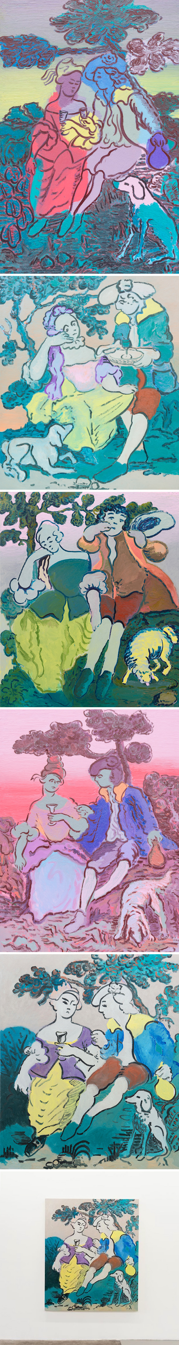
Ah, the past and present beautifully brought together in these colorful, narrative, large-scale oil paintings are the work of Vancouver-born, New York based artist Delphine Hennelly. Earlier this year she did an interview with Two Coats of Paint, and talked about this body of work:
“For these paintings, I was looking at a lot of work from the French pre-revolution period. With the ubiquitous image of couple and dog I have been eager to pin down a certain feeling of unrest and sociopolitical anxiety. The costume would be a nod to the notion or warning, whichever way you want to look at it, “History here repeating itself” in a domestic scene in its most benign form.”
And the stories – I have questions! Who are those people and, um, is that blue/yellow sheep okay?
“I’m not trying to tell a story about my life, and there’s no real person that this represents in my mind. But then they also become weirdly real because it does enter my thinking. It’s unavoidable. I feel you can’t get away from yourself or your histories. This might sound silly, but I saw all of a sudden the guy in Country Matters kind of looks like my son Leo. He has the look of a grown-up toddler. In a way, this was my son growing bigger than me, and that would be me, and I’m mourning the loss of his childhood. Also in the same painting, I didn’t realize the sheep appeared dead until the painting was up on the wall, out of the studio and everyone was talking about it being dead. Meanwhile, the dog in the other paintings is not the same as the sheep. It’s about fidelity, partnership, companionship. The sheep is something else, and I am OK with it appearing as though it’s on its way out, so to speak. I think Country Matters is ultimately about loss of innocence. There is a bit of a sadness in that painting. The sheep is the harbinger of that feeling. More importantly, the fact that the sheep’s “death” is ambiguous, lends a kind of farcical bend to the narrative. And that would be where my intentionality would lie.”
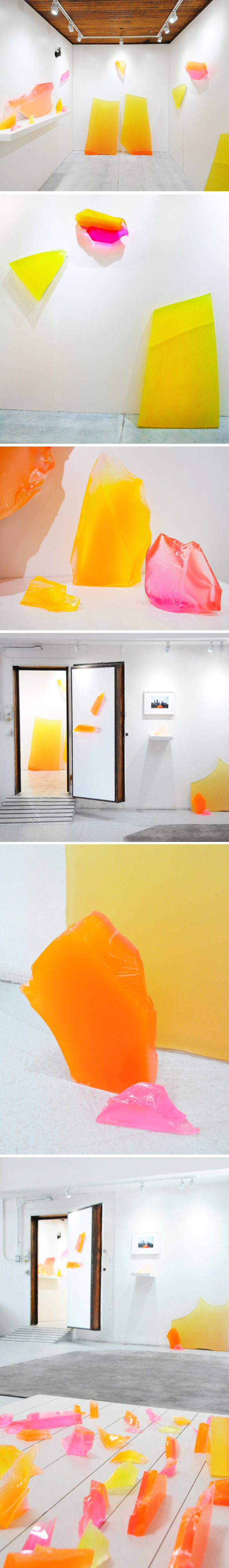
pnit by pneuhaus

Pneuhaus is a Rhode Island based design collective {Matt Muller, Augie Lehrecke, Levi Bedall} that focuses on “the mastery of all things inflatable”. Yep, clearly! Their most recent, totally breathtaking project is titled Pnit:
“Pnit magnifies the most basic knit stitch pattern so that this elegant and simple strength can be seen and the mechanics of it understood. Knit fabrics are a part of our daily lives, they cloth us and keep our beds warm; and yet as many of us lose track of the way the objects we interact with are made it can be easy to overlook the intrinsic structural beauty of fabrics.”
Pnit was created for PVDFest, Providence’s signature art festival, and will be illuminated in all its knitted glory throughout the summer of 2019. Happy Monday.