medium /// art for your ear : podcast


step-by-step. every day.

tinaberning1

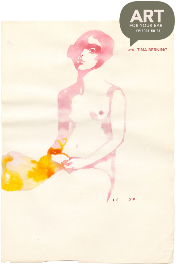
“Drawings are like wine, they need time to develop.” Lovely words from an amazing artist … who I might just have a major girl crush on. I have loved, and I mean loved, the work of Berlin based artist/illustrator Tina Berning for years. And now, if it’s even possible, I love it even more. Tina is obviously insanely talented, but I found out today that she’s also very smart, poetic, funny… and organized! I tried not to gush too much, but “fan-girling” was the name of the game. So, let’s get on with it. You can listen right up there under that lovely washy woman, or you can subscribe on iTunes.

First, these are just a few of Tina’s gorgeous paintings on found paper that are currently showing at Alison Milne Gallery in Toronto {until Nov 5, 2016}:

tinaberning2

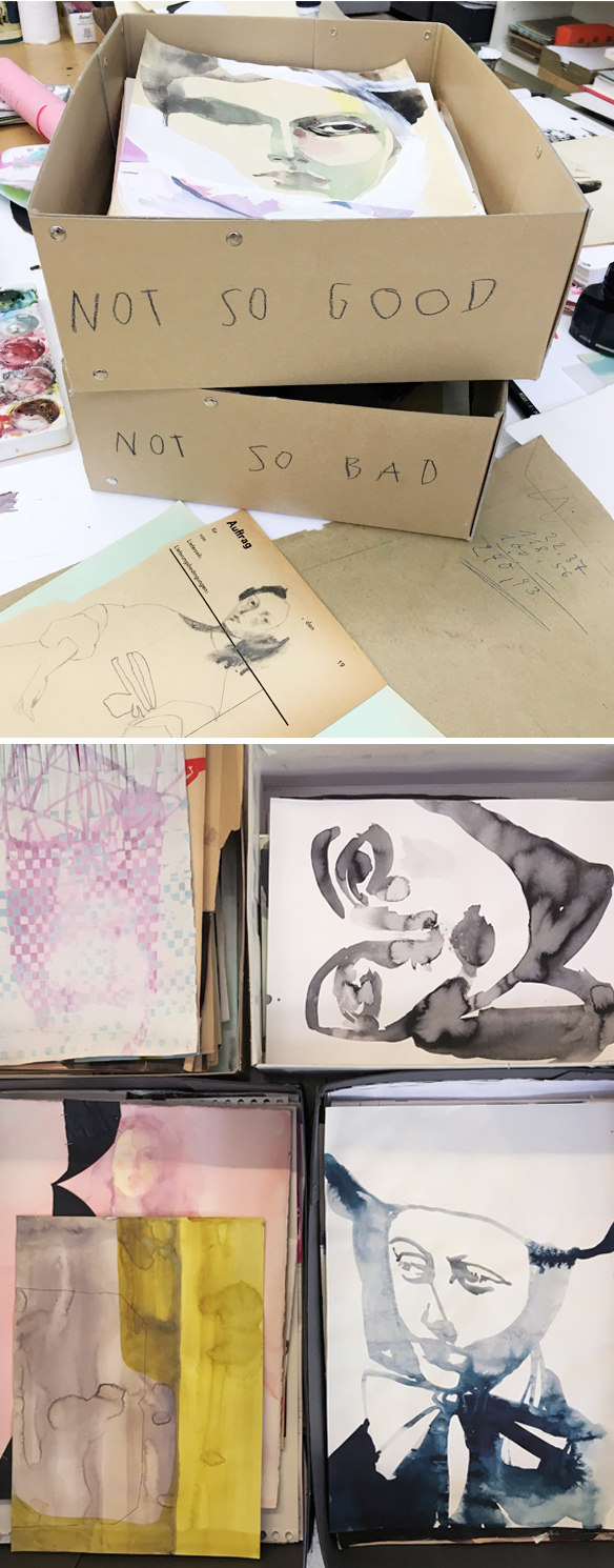
Gah! See? How can I not fan-girl over her! Now, here’s where the smart/organized part comes in. Everything she does goes into one of three boxes: CRAP*, NOT SO GOOD, NOT SO BAD:
tinaberning3

*CRAP not shown here … Tina assured me that there really is a CRAP box, but I can’t imagine any of her work ending up there. I love love love this system and I am totally going to implement it in my studio, and I honestly think every artist should. She comes back to the CRAP and NOT SO GOOD boxes later and uses those pages for collage bits, or as a base for new work. Truly brilliant, and a perfect jumping off point for creativity.

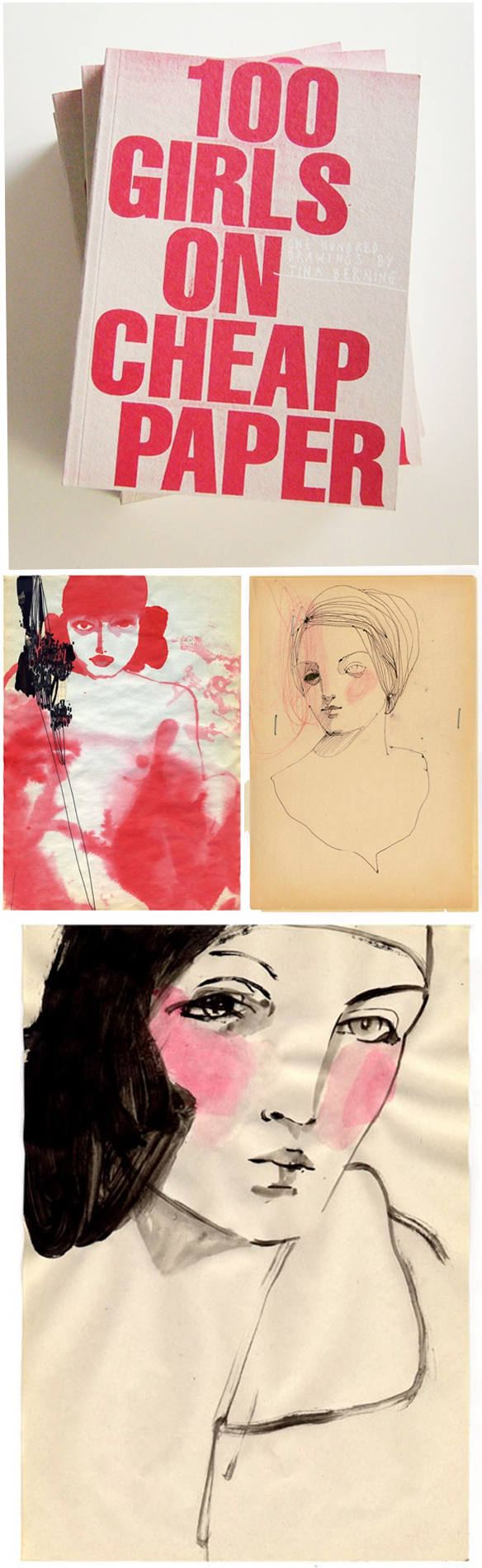
Next, one of my favorite projects ever, “100 GIRLS ON CHEAP PAPER”… which is exactly that:
tinaberning4

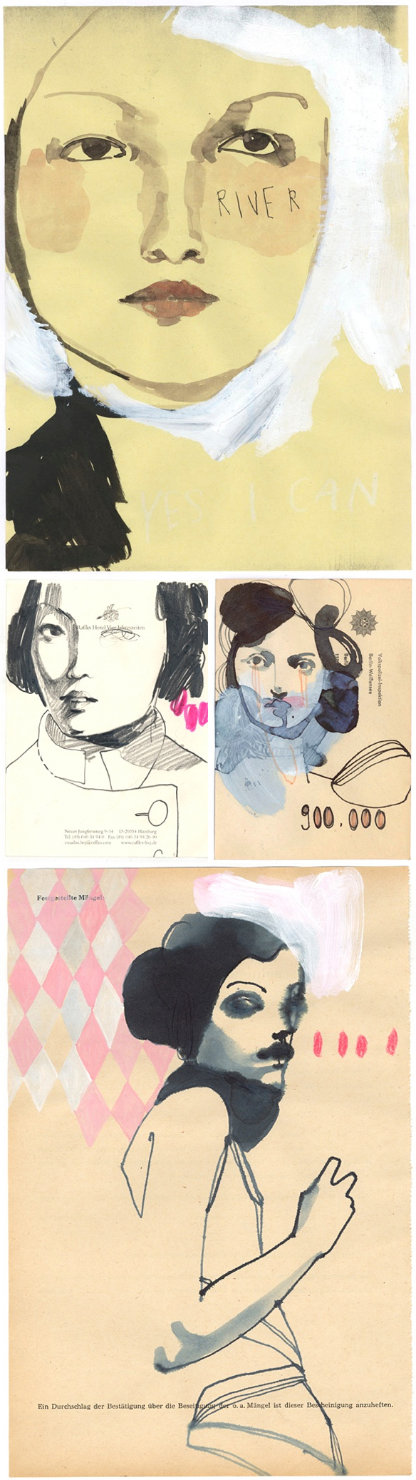
So beautiful. This project started online, it then became a book, and then a show… and then a traveling show. Most of the girls from the original exhibition sold, so when it traveled to New York and Japan, Tina had to paint 80 new women for each show! Here are two pieces from NY and two from Tokyo:
tinaberning5

Do you know how much self control was required for me not to post all of the pieces from this series? Very. Difficult.

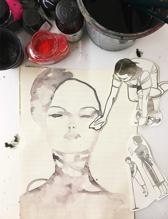
So, when you work on vintage found paper, most of your work will be small… unless you use old record album slips, or stitch lots of small pages together. Yes. That’s what Tina does from time to time, and no surprise, they’re gorgeous:

tinaberning6

The staples! I love the staples!

And finally, in the not-so-speedy speed round, Tina told me her favorite paint colors are black and red. I guess she wasn’t kidding:
tinaberning7

Yep, two words… Fan. Girl. Oh, I enjoyed this so much, and I hope you did too. Stunning work, a lovely person, and advice that I will use forever. Thank you so much to Tina for doing this with me, thanks to Saatchi Art for supporting this episode, and thanks to audible.com for making my new book into an audio book! To preorder a copy for FREE {or to pick up any other book you might want} just use my link: audibletrial.com/JealousCurator. But wait, there’s more… thank YOU for listening! There will be more art for your ear next weekend.

Other links:
  1. Tina’s current show at Alison Milne Gallery, Toronto 
  2. Heinz Edelman


“don’t discount small opportunities”

kate_rohde1

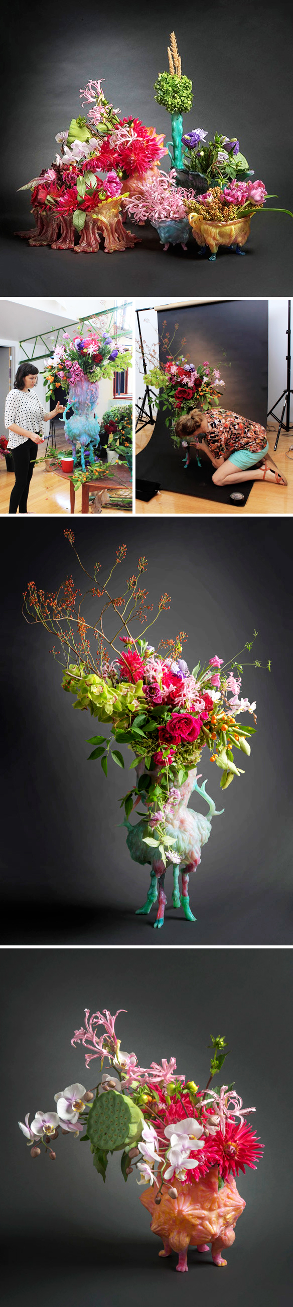
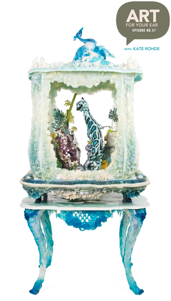
So, my plan had been to title this episode, “Reimagining Natural History”, which is the way Melbourne based artist Kate Rohde describes her work {as you can see from that fantastical blue display case up there} … but we just had so many great bits of conversation around the idea of just ‘saying yes and figuring it out later’ that I just had to kick things off with that thought! I wrote about Kate a few weeks ago, but last week’s guest, Sandra Eterovic, told me I had to reach out to Kate. So I did. And she said YES. Now, she’s not alone on this call. Her four month old baby boy was along for the ride! So sweet. You can listen right up there, or you can subscribe on iTunes.

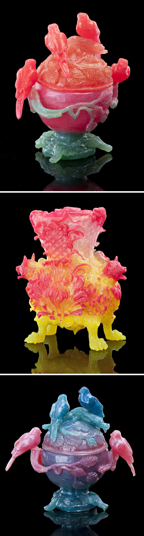
Let’s start off with a few of my candy-colored favorites from my recent post about Kate:

kate_rohde2

Yes! Remember those? So good.

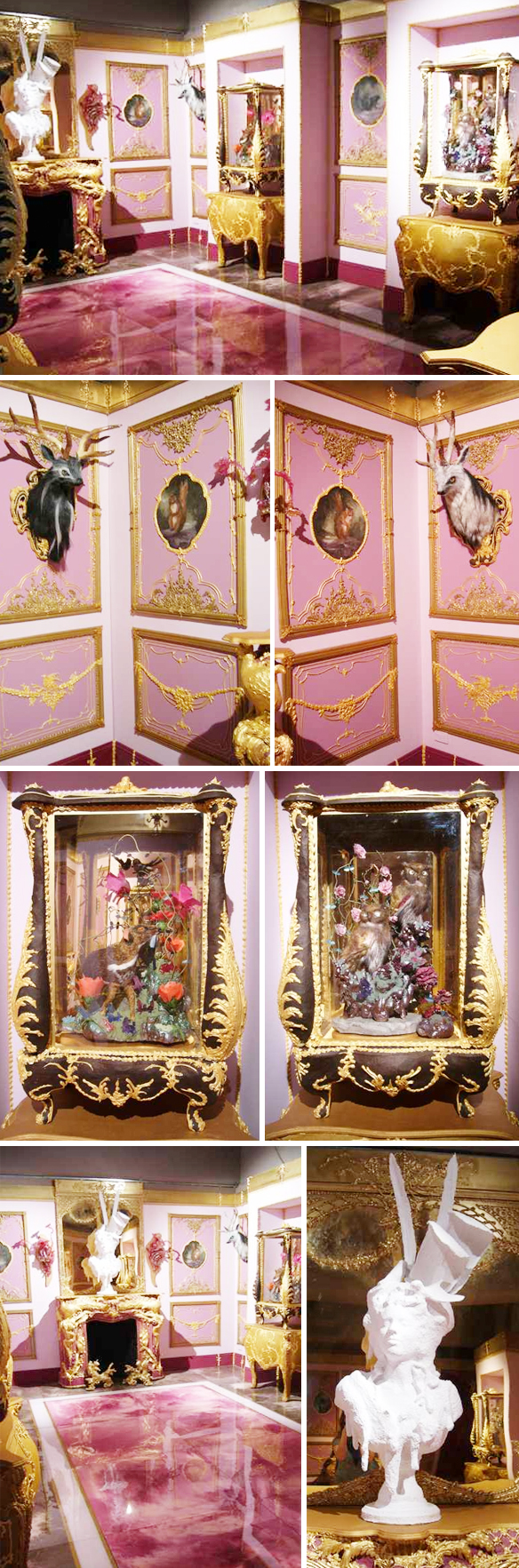
Next, here’s an installation, titled “Chateau Fatale” from 2005 that truly does “reimagine natural history”. I would happily spend the day in this super weird museum:

kate_rohde3

Fantastic! {Photos by Harry Fatouros}. Now, speaking of fantastic, I quickly mentioned Kate’s pieces under glass … mainly so that I had an excuse to put these images in the post:

kate_rohde4

That is a whole lot of colorful craziness… very different than the “brown and green” Australian landscape that Kate grew up in.

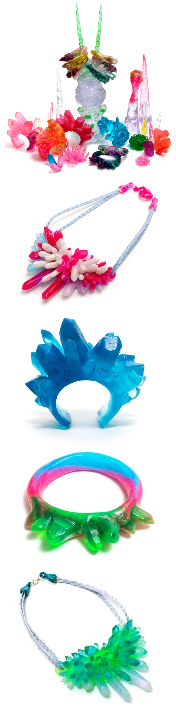
Up next, an insane collaboration with Australian fashion label Romance Was Born. They created custom textiles using collaged images of Kate’s work, and she made bizarrely beautiful resin accessories {yes, including horns}. This collection is called “Renaissance Dinosaur”, which might be the best name I’ve ever heard in my entire life:

kate_rohde5

Oh. My word. It’s like a crazy dream that I wish I could have every night. This project led Kate to making more jewelry… candy-hued, translucent, chunky jewelry that I would have a really hard time not licking:

kate_rohde6

Sigh. Stunning. ps. You can find Kate’s jewelry at Pieces of Eight, which also happens to be where I found these images.

One of my favorite bits of this episode was when we talked about lulls. Oh, lulls. You’d think they’d be a nice time to rest and recharge, but because we can’t predict the future lulls can feel more like THE END. Good news… they’re not. Not as long as you keep making stuff. During Kate’s lull she made vases. They don’t look like a lull to me! Now, we didn’t actually talk about this collaboration, but it’s just so beautiful I had to include it:

kate_rohde7

Now THAT is how you show off vases! Kate collaborated on this shoot with Melanie Stapleton from a floral studio in Melbourne called Cecilia Fox {that’s Melanie on the left, and Kate getting things just so on the right}. GORGEOUS! 

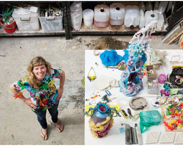
And finally, Kate in her home studio. She lives upstairs and works downstairs:

kate_rohde8

Love it… and of course, I love that chunky bracelet! Thank you to Kate for taking time to do this with us, and HUGE thanks to Tristan for letting me distract his mama for almost an hour. He did so well  ♥ Thanks to Saatchi Art for supporting this episode, and thanks to audible.com for making my new book into an audio book! To preorder a copy for FREE {or to pick up any other book you might want} just use my link: audibletrial.com/JealousCurator. Finally, and as always, THANK YOU for listening. There will be more art for your ear next weekend.

Other links:
  1. Sandra Eterovic episode
  2. Kate’s work on SaatchiArt
  3. National Gallery of Victoria
  4. Romance Was Born Collab.
  5. Kate’s upcoming show, “Luminous Realms” at Craft Gallery, Dec 9 – Feb 2017
  6. Kate in her studio: Photo by Tobias Titz


“i guess i better be an artist now”

sandra_eterovic1

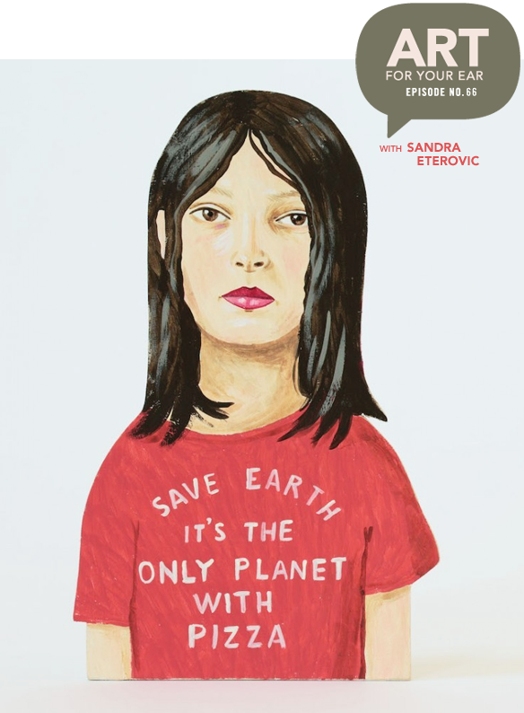
Oh, this was so much fun… but painful from a technology perspective! Don’t worry, we stitched it all together so hopefully you won’t even notice {thanks Greg!}. Today I’m talking to Melbourne based artist Sandra Eterovic. She paints weird and hilarious things on wood in a folk-artish yet modern way. Sandra went from studying Art History, to designing rude underpants, to making the scary jump to full-time artist… let’s just say her inner critic had an opinion about that. Anyway, you can listen right up there under that amazing pizza t-shirt, or you can subscribe on iTunes.

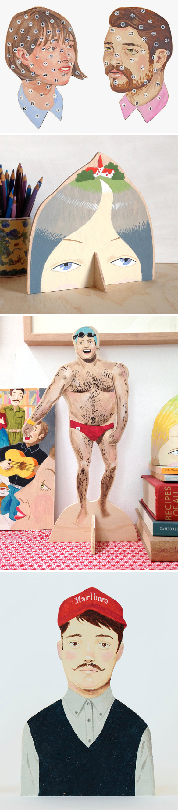
So, let’s start with a few of my painted cut-wood favorites:

sandra_eterovic2

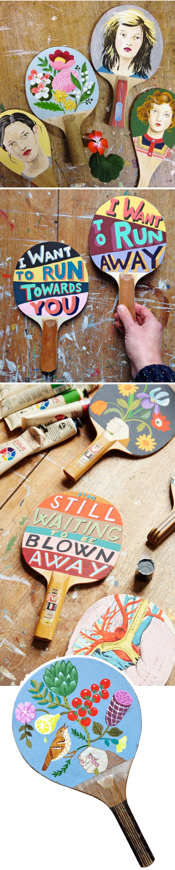
Marlboro. So awesome. Speaking of awesome… paintings on vintage ping pong paddles? YES!

sandra_eterovic3

Oh I love them so much… not to mention the salami and lemon growing off that vine! ♥

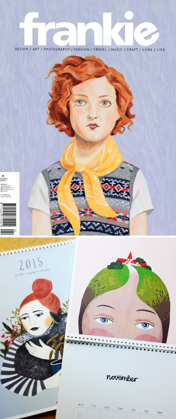
Up next, the gorgeous cover that Sandra did for Australia’s Frankie Magazine – and a shot of her page in their 2015 calendar:

sandra_eterovic4

So cool!

Now, let’s talk art prizes. The piece below, with all of the crazy t-shirts, titled “Read My Mind”, is the piece that Sandra has in the run for the R&M McGivern Prize. $25,000. Yeah. Just think of all of the wooden t-shirts she could make with that! If you’re in Melbourne on September 16th, go and vote for her! It’s a people’s choice award, so let’s get this done people! Here’s her painting, followed by a few of her other ‘funny things on shirts’ paintings that I love:

sandra_eterovic5

Come at me bro! HAHAHA! I love that one.

Ok, so in the not so speedy speed round, Sandra said she’d rather be a mermaid than a unicorn. This painting instantly popped into my head… I knew Sandra had painted a mermaid before. Here she is in the form of a sassy tattoo/scarf:

sandra_eterovic6

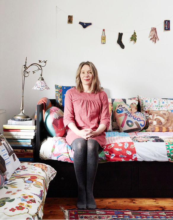
Ok, I’d want to be a mermaid too. And finally, I really wanted to include a photo of Sandra herself so you could see who you were listening to! Here she is in her lovely home {photo via The Design Files}:

sandra_eterovic7

Beautiful… Sandra, her work, this conversation, all of it! A lot of her work can be found in her shop, so pop over and pick something up … a flower-covered ping pong paddle perhaps! Thanks so much to Sandra for bearing with me through our technical difficulties, and for being so open and honest. Thanks to Saatchi Art for supporting the 66th episode, and thanks to audible.com for making my new book into an audio book! To preorder a copy for FREE just use my fancy link: audibletrial.com/JealousCurator. And finally, THANK YOU for listening. There will be more art for your ear next weekend.

Other links:
  1. Design Files 
  2. Frankie Magazine
  3. Craft Victoria
  4. R&M McGivern Prize, Melbourne
  5. Elizabeth Gilbert’s TEDTalk
  6. Martha Rich
  7. Lisa Congdon


“cheesiness aside, art gave me purpose”

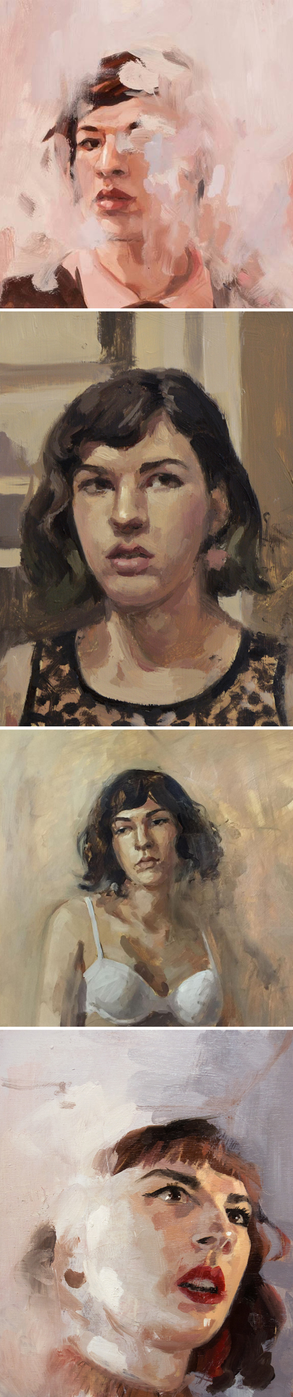
catherine_graffam1

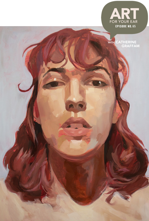
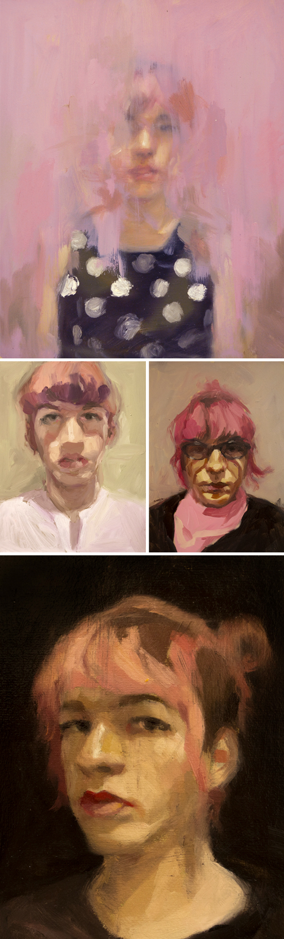
Much like a mother who loves all of her children equally, I love all of my podcast episodes equally… but this one is really quite special. New Hampshire based painter Catherine Graffam is only 23 years old. Yeah, 23. She didn’t find art until she was a senior in high school, at a moment when she absolutely needed it. She began painting self portraits as soon as she discovered oil paint and hasn’t looked back. Whether she realized it at the time or not, she would use painting to document the huge life transition she was about to make. Catherine is a trans woman and her paintings, sometimes sad but always beautiful, have been evolving and developing right along with her. You can listen to our conversation right up there under Catherine and her pink hair, or you can subscribe on iTunes.

First up, a few of my favorites to get things started:

catherine_graffam2

Gorgeous. That final piece is titled “Panic”… doesn’t it look like a still from an old movie? Love it. So much.

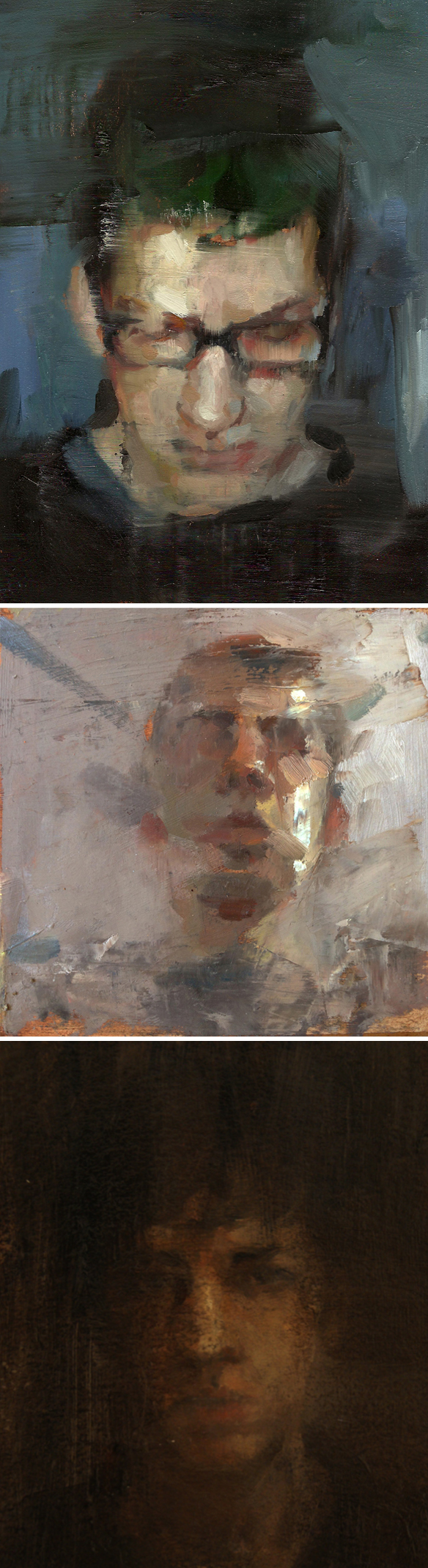
Next, these are the paintings that broke my heart when she sent me that very sad, angst-filled email while she was still in college:

catherine_graffam3

See? Dark. Literally and figuratively.

Throughout this episode I kept telling Catherine how brave I think she is. Exhibit A, “I Guess I’m Stuck With Me”… the painting she included in a show at college depicting the beginning of her transition:

catherine_graffam4

Beautiful, vulnerable, and BRAVE – whether she’ll admit it or not. The other two pieces are the paintings she mentioned that are also titled after song lyrics: “Head High, Tears Dry”, followed by “Anthem For A 17 Year Old Me”.

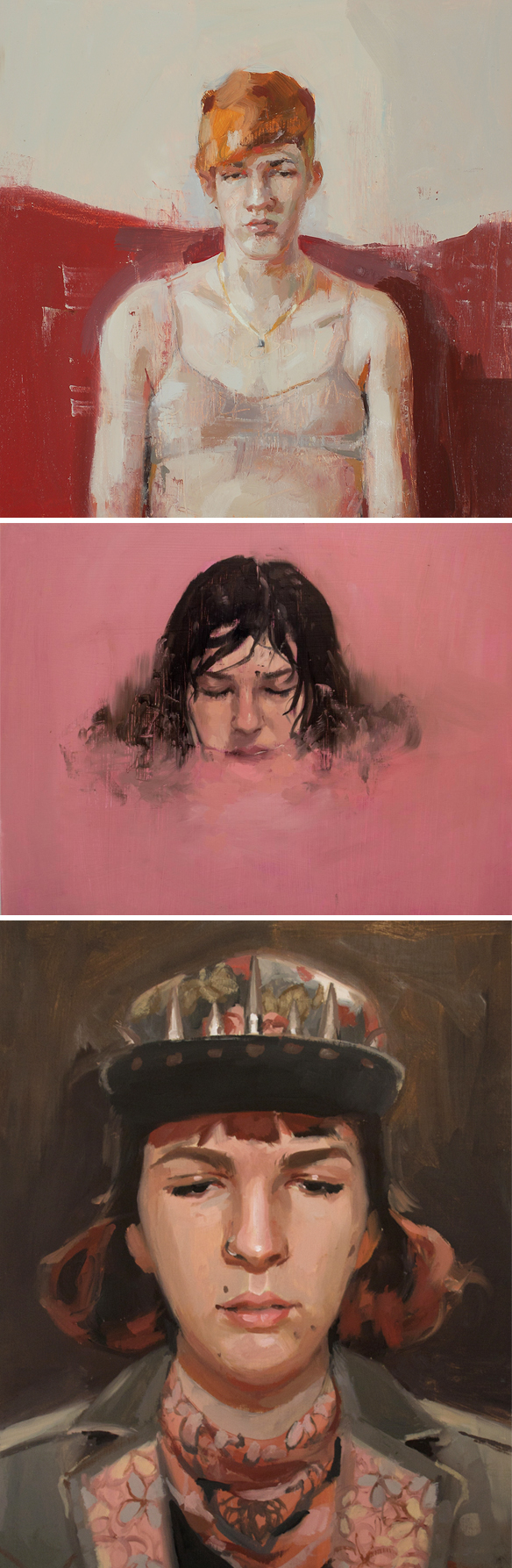
Her self portraits are the base of her work, but recently Catherine’s been pushing herself to paint other people. Different faces, different angles, different stories. Here are a few of my favorites:

catherine_graffam5

Ok, so clearly she can paint other people too! Gorgeous.

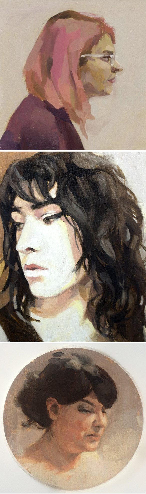
It wouldn’t be right not to include these beauties… not only does she rock pink hair, look at all of the color and light that has made its way into her work:

catherine_graffam6

Love.

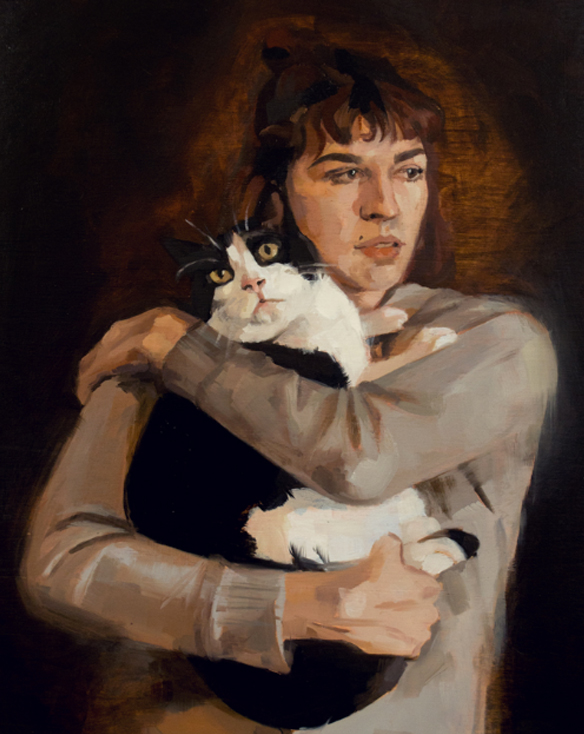
Speaking of love, this is Cat and her cat starring in, “Self Portrait as Madonna and Child”:

catherine_graffam7

Ha! So good. Thanks so much to Catherine for doing this interview with me, and being so vulnerable, honest, funny, and yes, brave. She’s only 23. TWENTY THREE. I am so excited to see what her future holds. Thanks to Saatchi Art for not only supporting this episode, but for also selling Catherine’s work. A big high five to audible.com for making my new book into an audio book! To preorder a copy for FREE just use my fancy link: audibletrial.com/JealousCurator  … and you know what comes next, thank you for listening. There will be more art for your ear next weekend.

Other Links:

  1. New Hampshire Institute of Art
  2. Emily Barletta episode
  3. Sean Beavers & Sydney Sparrow
  4. FKA Twigs
  5. “The Polygon Project”, Tasmania
  6. RISD
  7. “Gender Unbound” Show, September 24, Austin
  8. Saatchi Art to purchase Catherine’s work


“red bank red is from my yard”

amanda_brazier1

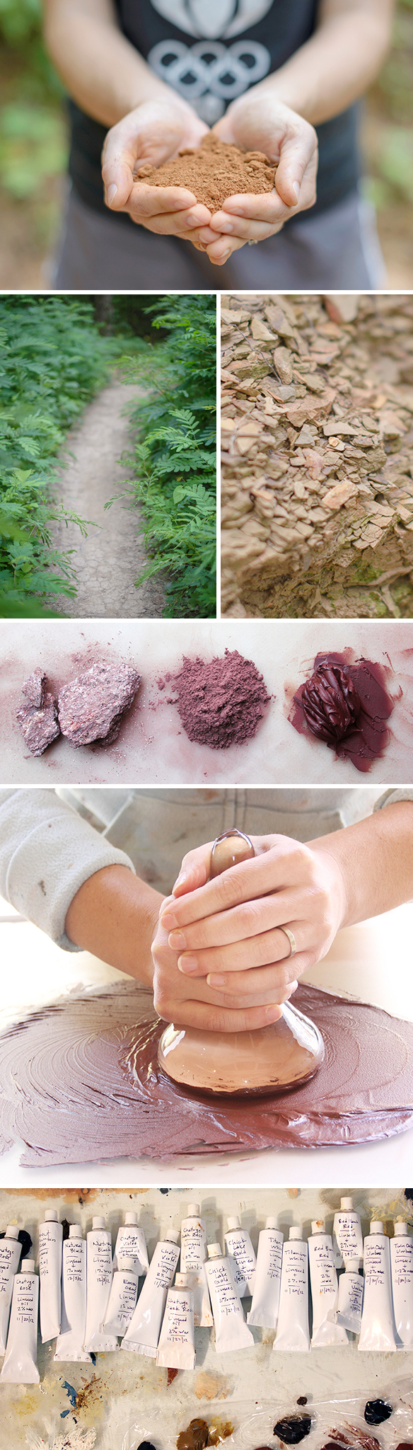
Clay from her yard, rocks from the side of the highway, and random bits of shale all turned into art supplies. Yeah, she MAKES HER OWN PAINT! A few years ago, at an art opening in Tennessee, I met Chattanooga based painter Amanda Brazier. We didn’t talk for long, but long enough for me to find out that she makes all of her own paint. Obviously I ran back to the hotel and looked her up… instant love. So here we are, years later, and I get an hour to talk to her about how she does what she does! We also talk about ice cream and running quite a bit. Brace yourself. You can listen right up there under Amanda’s freshly made paint, or you can subscribe on iTunes.

Let’s start at the beginning… the magical, natural beginning:

amanda_brazier2

Gah! Look at all of those perfect homemade tubes! And yes, there are quite a few Red Bank Red’s in there… straight from Amanda’s backyard. Amazing. And how perfect is it that she’s a trail runner and part-time high school cross country running coach!? She can gather samples while she’s out there ; )

She talked about how she’s able to make the different colors in her beautiful, quiet, natural palette. I wanted to know about this dreamy grey-ish blue:

amanda_brazier3

Oooh. I love them all!

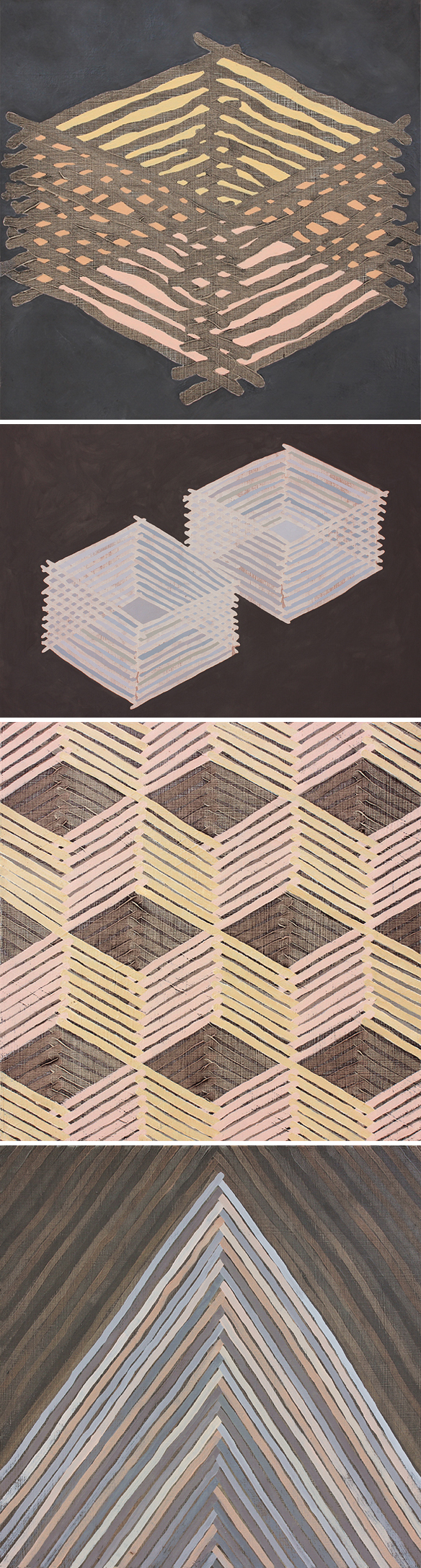
Up next… this is where Amanda’s fascination with structures began, and how it evolved:

amanda_brazier4

Lovely.

And finally, the painted “weavings” that give me a headache just trying to figure out what should go where and when:

amanda_brazier5

Oh my goodness… so so so good!

Thank you so much to Amanda for telling us the secrets behind her beautiful, natural work; thanks to Saatchi Art for supporting this episode; high fives to audible.com for making my new book into an audio book… to preorder a copy of the audio book FOR FREE, along with a 30 day free trial at Audible, you can use my fancy link: audibletrial.com/JealousCurator  … and as always, thank you for listening. There will be more art for your ear next weekend.

Other links:

  1. Mark Bradley-Shoup
  2. Freed Hardeman College
  3. Earth Pigments
  4. Natural Pigments
  5. Sandy Webster
  6. Cat planters by Beardbangs!


“modern frescoes and micro evolutions”

alicavanaugh1

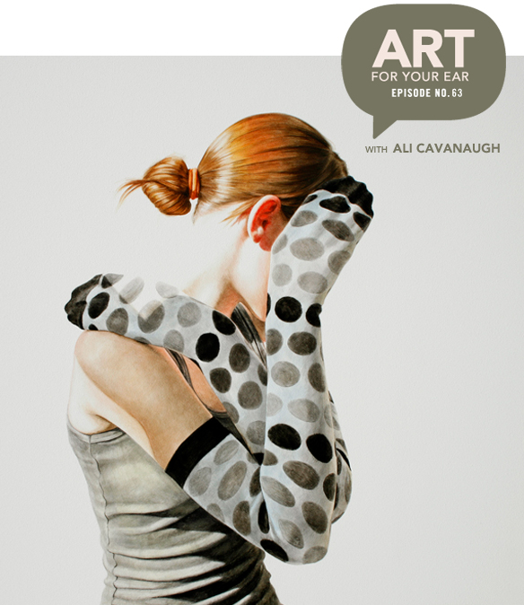
Modern watercolor frescoes, suitcases full of striped socks, and a mutual love for Swatch watches. Yep, this is what went down on today’s episode with American painter Ali Cavanaugh. I was so curious about her process – she paints on panels coated in a thin layer of clay!? Obviously I asked her all about that. I also had a question that read as follows, “arms, legs, striped socks… why?” Well, she told me! You can listen right up there under the dot-covered arms of that lovely redhead, or you can subscribe on iTunes.

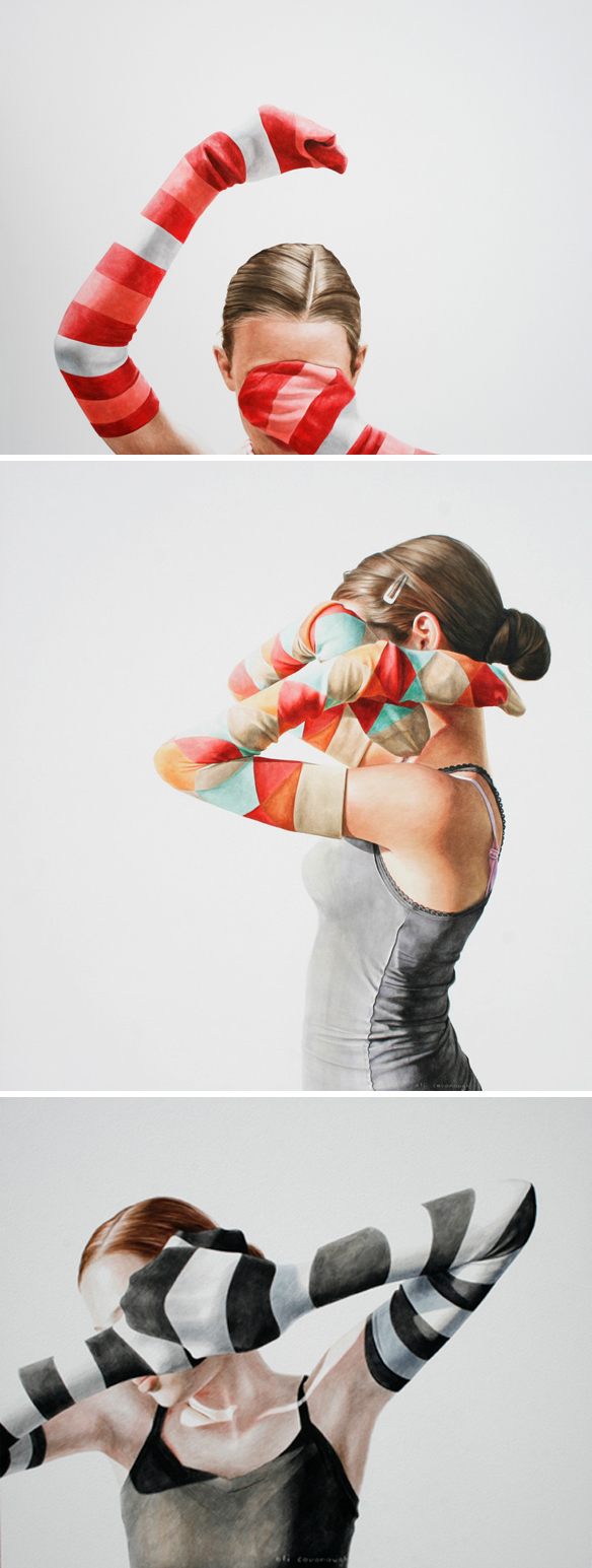
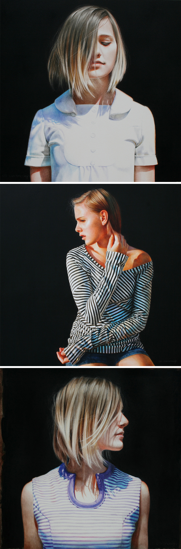
Let’s begin with a few arms ‘n socks. I’m sure you’ll recognize this work – it was all over the interweb a few years ago {including my site of course}:

alicavanaugh2

I love them oh so much. Not only are the stripes and compositions absolutely fantastic, um, these are watercolors! Stun. Ning.

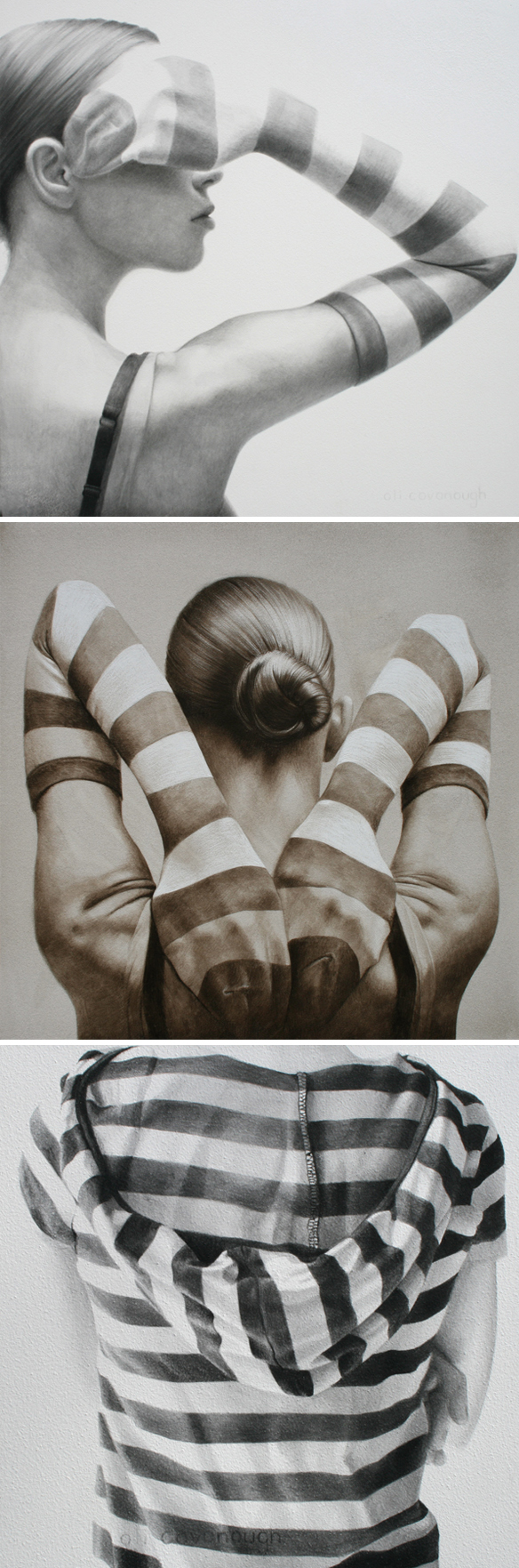
Ali mentioned moving from oils to watercolor as an experiment. For those pieces – pieces that basically changed her life – she only used one color for each painting. These are not the exact pieces, but they’re from her “monochromatic” portfolio so that you can see what they look like:

alicavanaugh3

Again, I must reiterate… these are watercolor paintings!

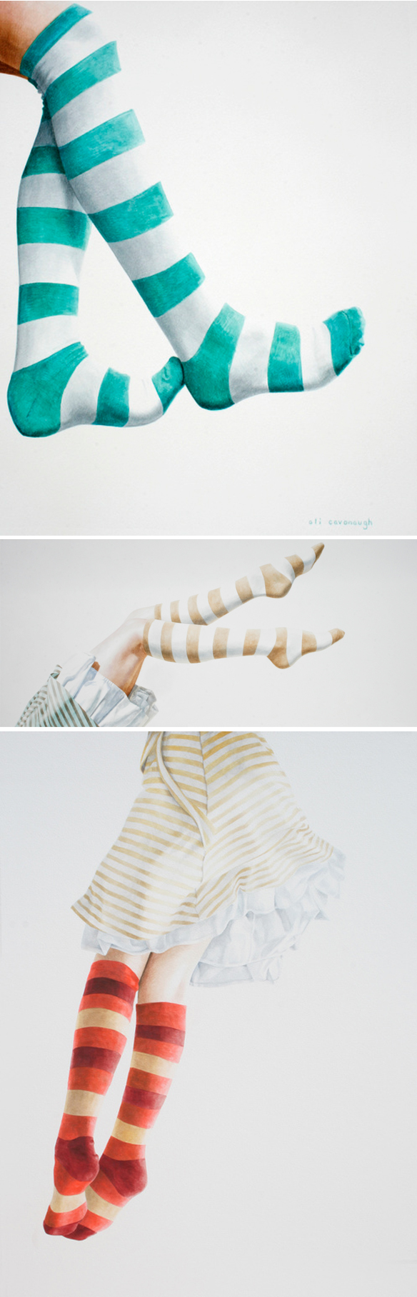
Alright, and now, onto the legs! This is where the striped socks began:

alicavanaugh4

So feminine, so absolutely lovely… as was her reason for starting these swinging legs in the first place.

Oh, now this series is beautiful, on so many levels. Here are just a few paintings from the “Milly” series:

alicavanaugh5

A teenager with a very aggressive form of cancer who became Ali’s inspiring, light-filled muse for the series. And in case you haven’t listened to the episode yet, I’m very happy to report that Milly is in full remission! Ali has painted her several times since, and yes, these pieces are insanely beautiful too:

alicavanaugh6

I mean, come on. GORGEOUS. Also, I want Milly’s haircut.

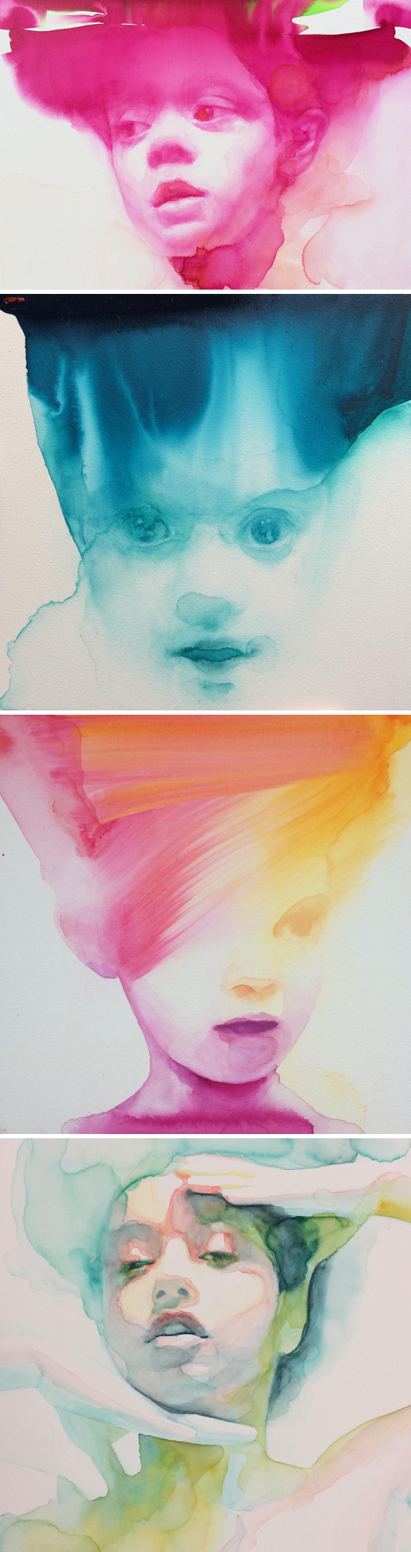
From oil, to watercolor, to washy watercolor… the micro-evolutions that keep Ali’s work fresh. These are some of her latest portraits:

alicavanaugh7

Dreamy, yes? Sigh.

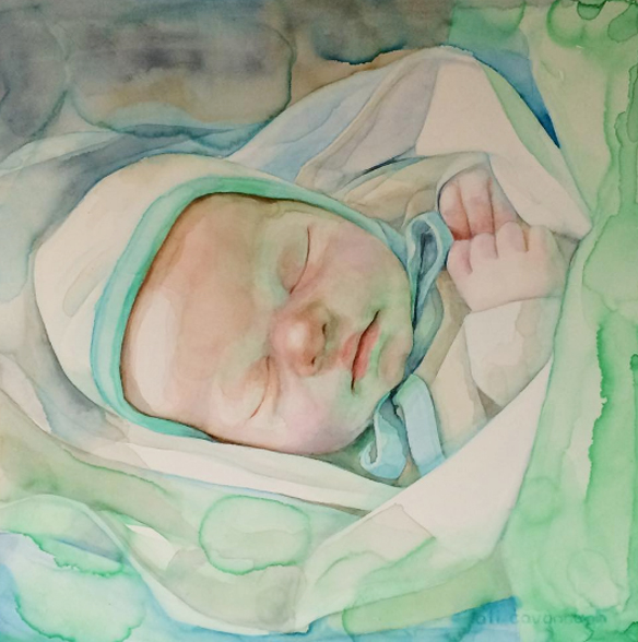
I had to include this, even though it makes me sad. This is the portrait Ali was asked to paint by a mother whose baby was stillborn. She wanted an image of him that was filled with life and love:

alicavanaugh8

Beautiful. And heartbreaking. And beautiful.

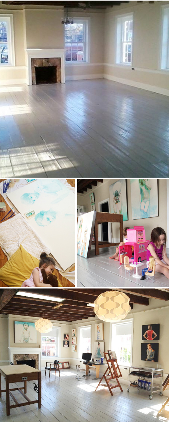
And finally, a peek into Ali’s brand new studio. I found these images on her lovely instagram feed:

alicavanaugh9

Gah! That light… are you kidding me!? She’s got everything she needs in there – big windows, lots of space, and a few cute kiddos to keep her company.

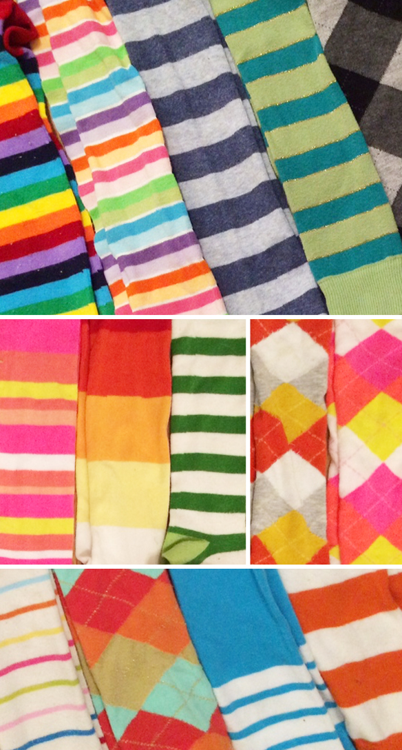
Ok, and before we wrap things up, Ali took a few photos of her insane sock collection for us:

alicavanaugh10

And that’s just a few of them! Yeah, that’s alotta socks. Thanks so much to Ali, a fellow Swatch lover, for taking the time to chat with me; thanks to Saatchi Art for supporting this episode; high fives to audible.com for making my new book into an audio book – and for letting me narrate?! To preorder a copy of the audio book FOR FREE, along with a 30 day free trial at Audible, you can use my fancy link: audibletrial.com/JealousCurator

… and last, but certainly not least, thank YOU for listening. There will be more art for your ear next weekend.

Other links:

  1. Kendall College of Art & Design
  2. Affordable Art Fair, New York
  3. Milly’s work
  4. L.Ross Gallery, Memphis
  5. Swatch!
  6. Short film about Ali… so good!


“painting with flowers”

rebeccalouiselaw1

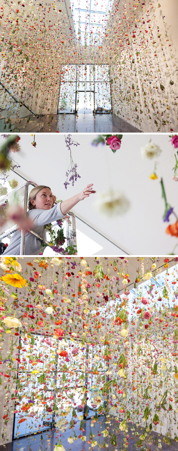
Oh my WORD. I’m pinching myself over this episode. I absolutely love the work of London based installation artist Rebecca Louise Law. I’ve written about her before, but I was so excited to finally talk to her in person. I wanted to find out where her story began, if she’s afraid of heights, and why she’s obsessed with hanging thousands of flowers from ceilings all over the world. Actually, I’m kind of obsessed with her hanging thousands of flowers from ceilings all over the world too. You can listen under those flowers hanging in London’s “The Garden Museum”,  or you can subscribe on iTunes.

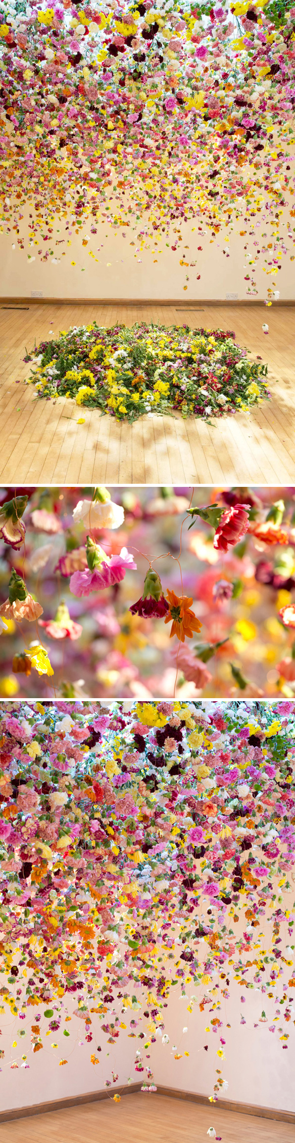
Let’s start with these beauties… they are the first installations of Rebecca’s that I ever saw {aka when my obsession began}:

rebeccalouiselaw2

Right? Well things got a lot bigger from there. More wire, more height, and of course, MORE FLOWERS. Here are a few random shots of awesomeness, including Rebecca in action:

rebeccalouiselaw3

Can you even imagine standing under these suspended gardens? Can you imagine wiring and hanging all of these suspended gardens?!

We didn’t actually talk about this installation, at Bikini Berlin, but I had to include it:

rebeccalouiselaw4

Wow. {photos via Bikini Berlin}

I’m pretty sure we touched on this installation for a few seconds, so I think that’s enough for me to include these gorgeous photos! The show is titled “The Beauty of Decay” … it just came down yesterday {sorry!} in San Francisco:

rebeccalouiselaw5

Oh, so dreamy. I love the photos of the work, but I have to say, I love the photos of Rebecca in action just as much. I’d be thrilled to watch her install one of these stunning gardens someday. {photos via Chandran Gallery, San Francisco}

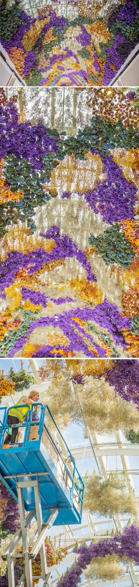
Ok, this is the big beautiful crazy piece we talked about the most! “The Canopy”, a permanent installation in Melbourne… that used over 100,000 flowers!

rebeccalouiselaw6

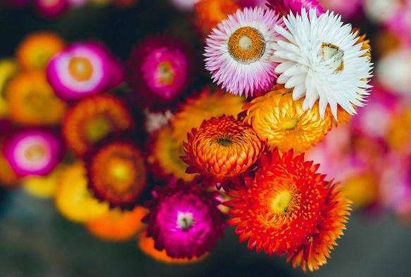
Yes! And also, NO… I could not get myself up that high, hence asking her about a possible fear of heights during the speed/get to know you round! That’s also where I found out which flower she would use if she were only ever allowed to use one flower from now on. After careful thought, Rebecca chose…

rebeccalouiselaw7

Helichrysum aka straw flowers. Excellent choice. Oh, that was really, really fun… and mark my words, she is headed straight for the art history books! Thank you so much to Rebecca for fitting me into her insanely busy / flower-filled schedule, thanks to Saatchi Art for supporting this episode, a new thank you to audible.com for making my new book into an audio book – and for letting me NARRATE?! To preorder a copy of the audio book FOR FREE, along with a 30 day free trial at Audible, you can use my fancy link: audibletrial.com/JealousCurator

And you know what comes next … a BIG thanks to you for listening. There will be more art for your ear next weekend.

ps. Artists need to know math. Stay in school, kids! ; )


“art. therapy.”

emily_barletta1

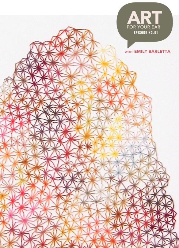
Oh boy. The work of Brooklyn based artist Emily Barletta blows my mind, and has for years! She is a very talented woman, with an incredible story that I really want to share. Emily was diagnosed with a rare spinal disease when she was in her early teens, and was in a huge amount of pain for years – both because of her back, and because of the bullying she experienced. We’re talking about alllll of that today, but I will slip in a spoiler – yes, she used art to push herself through to the other side. She’s incredibly inspiring, just like her work. If you are a teenager, or if you have a teenager, I think this is a really important episode. You can listen right up there under that insanely beautiful embroidered mound, or you can subscribe on iTunes.

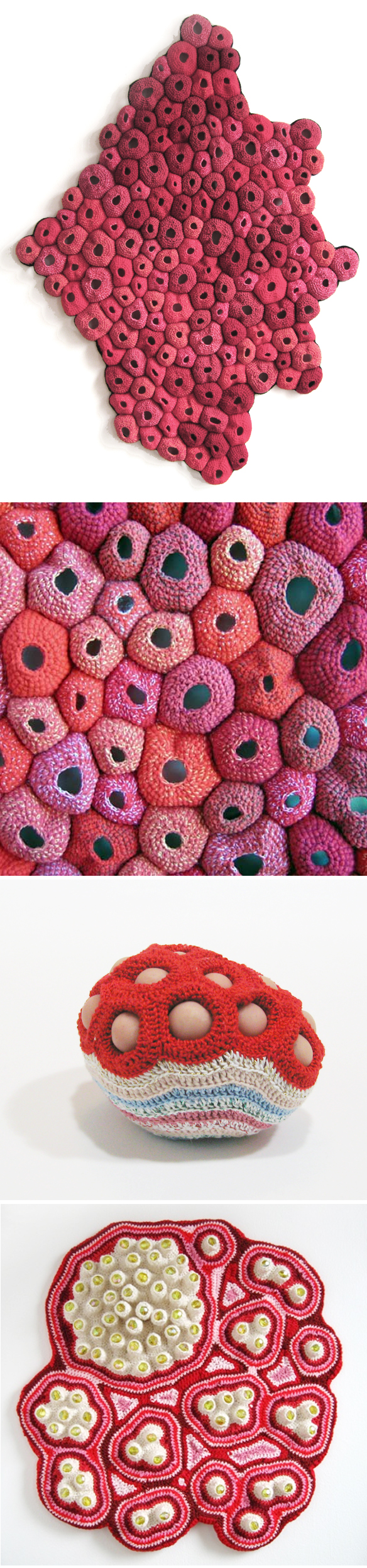
Alright, let’s take a peek at the work we talked about. Here are some of Emily’s crochet pieces from a few years ago {this is the work I discovered her through}:

emily_barletta2

That first piece is “Pelt” which we mentioned. Isn’t it all so amazing? Art and science falling madly in love!

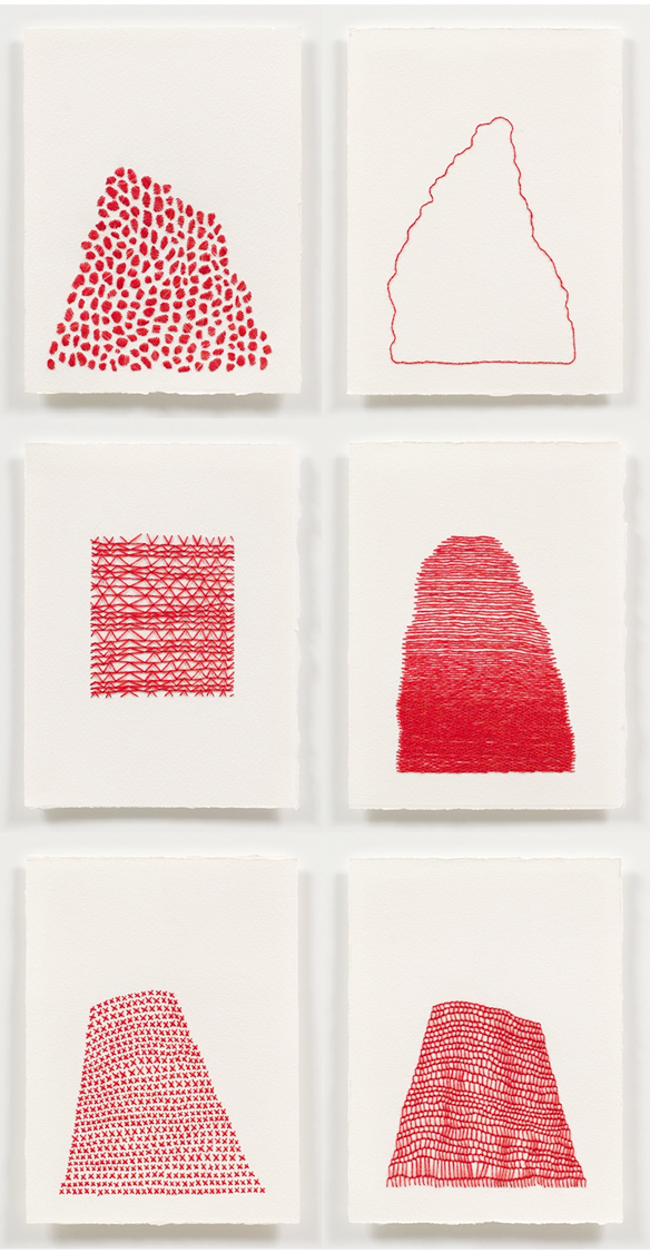
And then one day she decided to embroider on paper. Excellent decision, Emily:

emily_barletta3

So beautiful! Still mainly red, still mainly hump-like. And her work continued to evolve from there. Brace yourself because these are crazy amazing:

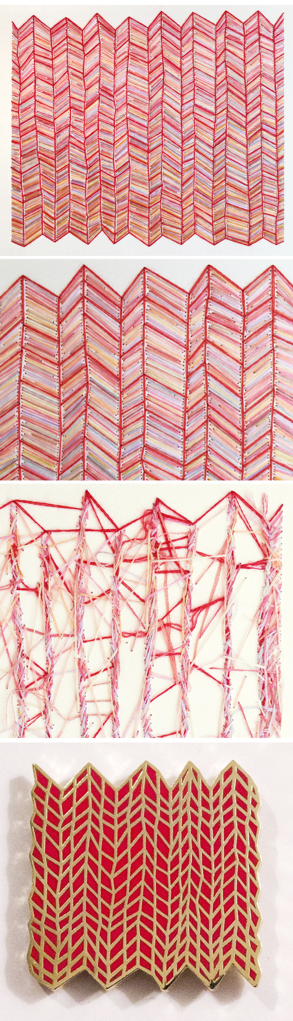
emily_barletta4

Whoa. I wish I could show you how stunning these are in person. Yes, the photos are lovely, but in person, my goodness! I happen to know this because out of nowhere, Emily sent this to my house:

emily_barletta5

Oh. I love it so much! She mentioned how crazy the back of her work is so I took a photo so you could see. And that final image is the pin she has for sale in her shop that totally reminds me of my gorgeous piece [pause in writing] Ok, I just popped over there and got one! YAY!

And finally, her latest work. She talked about “drawn white lines”… they’re kinda drawn, but then embroidered around leaving her lines as un-embroidered negative space. Here are a few final pieces, closeups, and in-progress pieces so you can see her process in action:

emily_barletta6

Stun. Ning.

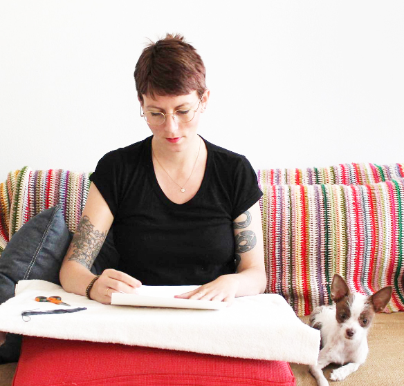
And finally, Emily herself! Here she is with a brand new pixie cut, working on her couch {probably watching bad TV as she creates}, with one of her two tiny pooches by her side, and her “block blanket” behind her. The “block blanket” is one of the most brilliant things I’ve ever heard of! Whenever she was stuck/not feeling it when working on something, she’d take a break and go crochet a few rows of this giant, colorful blanket until she worked her way through the block. LOVE. I may have to take up crochet just for that!

emily_barletta7

Thank you so much to Emily for sharing her story. I added a little bit of our “post-interview” conversation in there because she talked about the bullying she suffered through in high school, and the fantastic way she handled it – I just had to share. I know there are teenagers out there who feel alone, but just know that it does get better. Emily is proof.

Thanks to Saatchi Art for supporting this episode, and thanks to you for listening {high fives to everyone who has left a rating or review over on iTunes… I appreciate those so much!} There will be more art for your ear next weekend.

Other links:
  1. Stumpkins {My craft obsession as a kid}
  2. John Cage’s “Some Rules for Students and Teachers”
  3. True Blood {TV show}
  4. “Mind Over Matter” {Emily’s upcoming show in Florida}
  5. ps. sorry for all of the chip talk – I must have been hungry!


“drawing with porcelain”

katharine_morling1

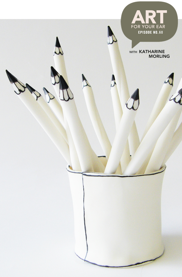
Oh my goodness, I am in love with everything this woman makes. I am so excited to finally be talking to London based artist Katharine Morling. Her work looks like wonky black & white drawings… that happen to be made of porcelain! I had so many questions about her narratives, her process, and of course her story. Where did the idea for these beauties come from?! You can listen right up there under that lovely “pot of pencils”, or you can subscribe on iTunes.

Let’s get started with “Nature Boy”, shall we? He started in this little box, which led to all of the work below him {and there’s even more on her site!}:

katharine_morling2

Porcelain cameras?! A butterfly net?! No, no, no… it’s all just too good.

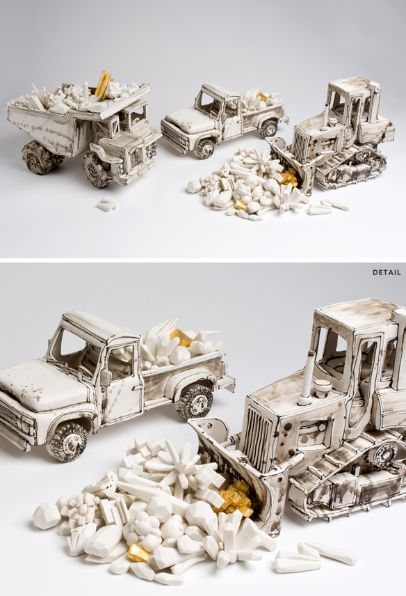
This is the piece Katharine was talking about when she said she’s still not quite sure what it’s actually about! This is “Shifting Diamonds”:

katharine_morling3

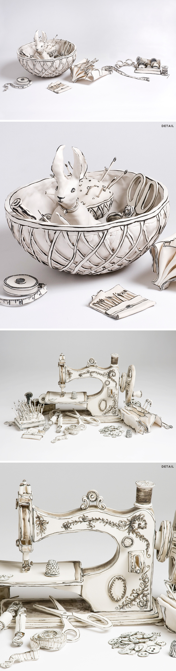
Gorgeous. Up next, the sewing basket she got at a very exciting Tupperware party when she was a kid, along with her mother’s sewing machine:

katharine_morling4

I mean, come on! I want need a pair of those scissors.

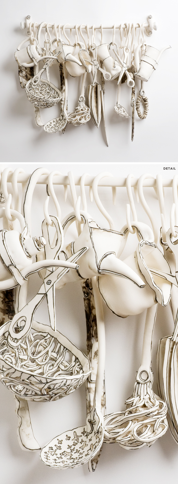
This next piece is “Equipped”. Note the crosses she mentioned in a few of these beautiful household utensils:

katharine_morling5

Lovely. That whisk might be my favorite.

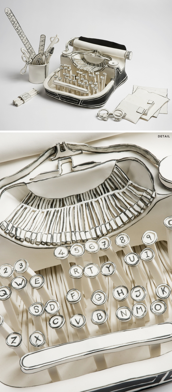
Ah, her typewriter! I have loved this piece, titled “Poison Pen”, for ages but boy oh boy it certainly has new meaning after finding out that Katharine has severe dyslexia:

katharine_morling6

… hence the wonky, confusing state of this lovely, porcelain machine.

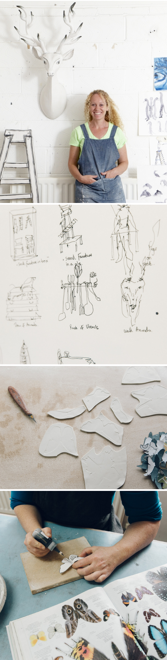
I loved hearing about her process too! From sketching, to clay, to the fine line work {and I had to include a photo of Katharine so you could see the gorgeous woman behind that lovely English accent}:

katharine_morling7

Ah yes, nothing like a little peek behind the curtain!

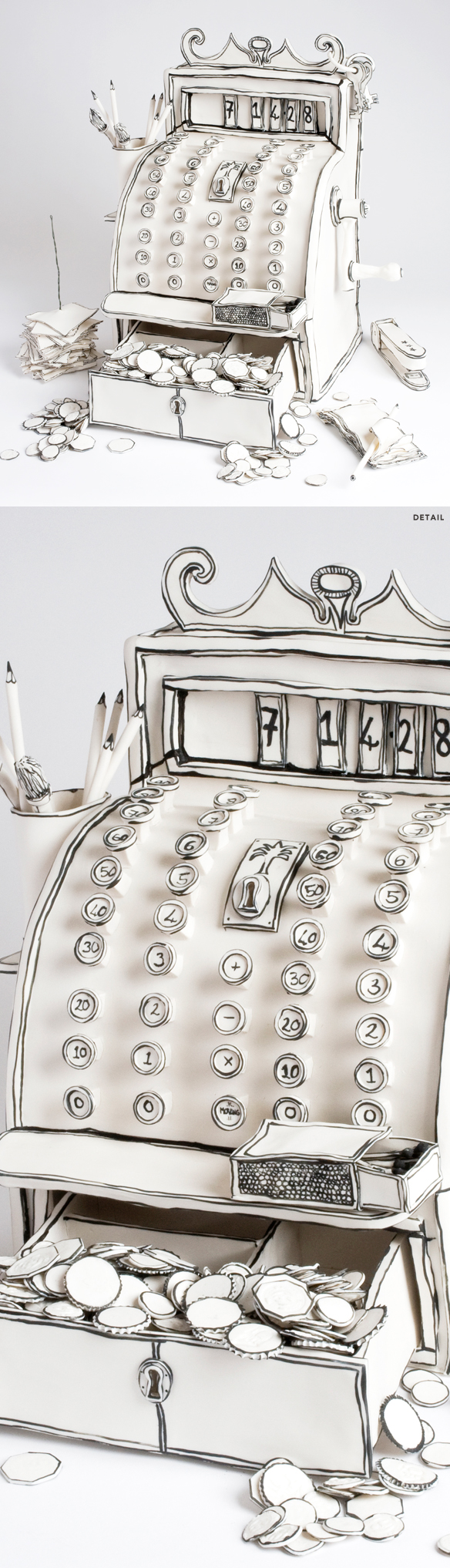
And finally, a gem from the ‘speed round’. Katharine’s first job, when she was 13, was at a tiny little green grocer’s. This was their cash register, and it inspired a piece titled “Plenty”:

katharine_morling8

Her whimsical detail is just so insanely amazing! Look at that little box of matches… and those pencils… and allll of those coins! Sigh. Too good. And with that, I’ll say thanks to Katharine {and Rosie!} for spending an hour with me, big thanks to Saatchi Art for supporting episode 60 {!?}, and as always GIANT thanks to you for listening each week. There will be more art for your ear next weekend.

Other Links:
  1. Cockpit Arts, London
  2. Royal College of Art, London
  3. She is represented by Long & Ryle Gallery, London
  4. Louisa Taylor
  5. A few of the studio shots are from this New York Times article
  6. Some of Katharine’s smaller works are available in her shop


“magical portals & secret painting parties”

rebeccachaperon1

Oh, so many mysterious landscapes, strange little girls, and what I can only assume to be a lot of empty tubes of black paint! I’m talking to Vancouver based painter Rebecca Chaperon today, and as usual, I have lots of questions. Warning: We had some major technical difficulties getting this episode recorded, but we did it! There is the occasional wifi glitch, so just ignore those, ok? Thanks! You can listen right up there under Rebecca in her studio, or you can subscribe on iTunes.

Let’s start with the first series of Rebecca’s that I ever saw… “Like a Great Black Fire”:

rebeccachaperon2

Gorgeous! And surprising to learn that she didn’t actually use that much black paint. Speaking of which, we talked about the dramatic swing she took with her color palette – from dark/moody to pastel/sweet. Her work still looked like her work, but the colors were flipped. Here’s a little visual evolution:

rebeccachaperon3

Ahh! I love it all, but if you follow me, you’ll know that I have a soft spot for pink. That final piece – “Lady of the Pink Lake” – yeah, I am completely and totally in love with that! It’s a perfect blend of all of her work… ice, landscapes, portals, weird little girls. Love it.

Other things I love from Rebecca’s portfolio? These amazing crystals, ie. her “Tesseract” series:

rebeccachaperon4

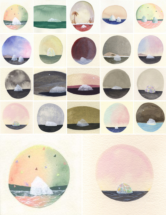
Oh my goodness… it’s like her flat portals have found a whole new candy-hued dimension! And onto more pastel gems from here. Rebecca’s mini iceberg series:

rebeccachaperon5

I’ve loved these for years, but had no idea the lovely story behind them {hence the reason I’m addicted to doing this podcast!}. 

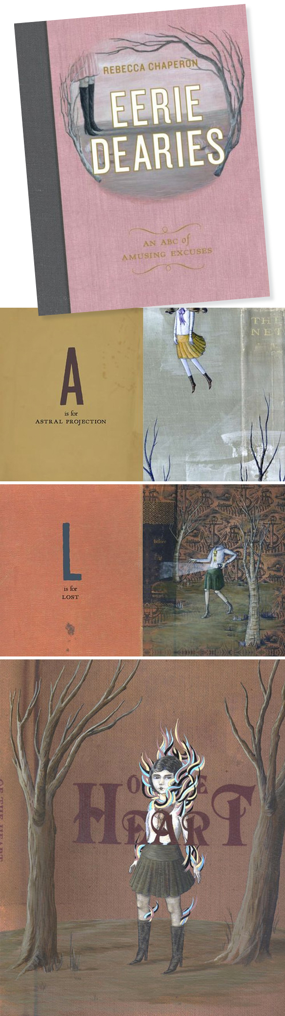
So, from paintings of icebergs and crystals to this beautiful/creepy book, titled “Eerie Dearies”

rebeccachaperon6

Ha! So great! An A to Z book that gives you “26 Ways To Miss School”. Edward Gorey would be proud!

Oh, and I was very excited to find out more about this. Secret painting parties? YES!!!

rebeccachaperon7

Crystals, moons, ladies and paint… sounds like a perfect evening to me. If you’re interested in finding out how to get yourself into one of these secret painting parties, click this secret link.

And finally, Rebecca’s black bob that I love oh so much:

rebeccachaperon8

So chic … well, except for the spiders. Thank you so much to Rebecca for doing this – and bearing with me during our technical difficulties – thanks to Saatchi Art for supporting yet another episode, and big thanks to you for listening! There will be more art for your ear next weekend.

Other Links:
  1. Emily Carr University of Art & Design
  2. Opus Art Supplies
  3. Grunt Gallery
  4. Little Mountain Gallery
  5. Richmond Art Gallery
  6. Vancouver Art Gallery
  7. Dandelion Emporium
  8. Pecha Kucha (Vancouver) & Rebecca’s talk


Testez les jeux en ligne casino les plus populaires du moment et plongez dans un univers de gains potentiels, d’action continue, de graphismes modernes et d’ambiance réaliste.