medium /// painting


jennifer davis {new show}

Strange new world, indeed! This is the latest work by Minneapolis based Jennifer Davis, and all of it’s hanging side by side right at this very moment. “Strange New World” is currently at Artspace in Raleigh, North Carolina and will be up until October 27th … in other words, wait for Hurricane Florence to make her way through, THEN pop in to see the show. Safety first, art a very close second. Happy Friday … stay safe, east coasters.


amy earles

Did I want to save this post for Halloween? Yes. Was I able to control myself? Nope! These gorgeous / creepy pieces are the work of American artist Amy Earles. Whether she’s working in pencil or paint, the results are just as elegant … and just as disturbing. Perfection.

ps. Some of Amy’s work is available in her shop … including a few fantastic paper dolls!


eric louie

This is the absolutely breathtaking work of Vancouver based painter Eric Louie. Yes, they’re paintings. I know. I stared at those metallic ribbons of gorgeousness for ages before believing that they were, in fact, oil paintings. I found Eric’s work through Bau-Xi Gallery, who has recently begun representing his work, and here is a snippet about him from their site:

“Louie’s current body of work is the culmination of his experiences as a painter. He describes his work as alluding to landscape, still life, portraiture and how those genres surface in each piece; inventing scenes via many thin layers of luminescent glazes. The delicate, yet dynamic forms that he depicts are central to the ‘virtual worlds’ he creates for the viewer to explore.”

Yep, I could happily explore these worlds… FOREVER.


“mythology and mounds of soil”

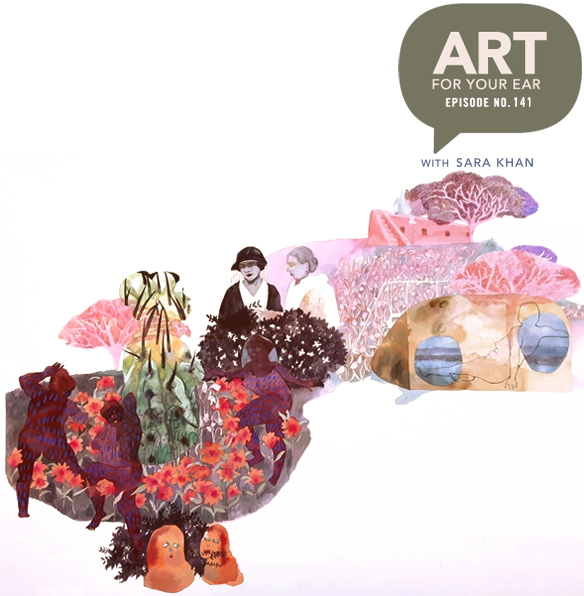
Oh boy… do you know what this means? Yes, my podcast – “Art For Your Ear” – is back! I’m kicking off season no.3 with the talented and hilarious Sara Khan. Born in England, raised in Pakistan and now based in Vancouver, Sara has all sorts of experiences and stories to draw from. We’re also covering important topics such as giving birth to kittens and / or dragons. Listen right up there under “Womens Games”, or subscribe on iTunes.

First up, images from Sara’s series “Ubiquitous Follies” which I fell madly in love with last year. These pieces are a great introduction to the magical watercolor worlds she’s been creating recently:

See? Her own worlds, filled with mythology and hidden meanings. LOVE.

Speaking of love, here’s a peek at the gigantic wall Sara did for the 2018 Vancouver Mural Festival:

Oh my word. Seriously. So gorgeous, but even more impressive … that she figured out a way to translate her smallish watercolors into a large-scale mural done with house paint. House. Paint.

I thought this would be really interesting for you to see. Sara talked a bit about her work from a few years ago – which of course ultimately led to what she’s doing now – that involved using mainly charcoal:

These are great too, but you can see that she was looking for her style. Well, she found it!  Here’s what is happening in 2018… I found these on her site and her Instagram feed:
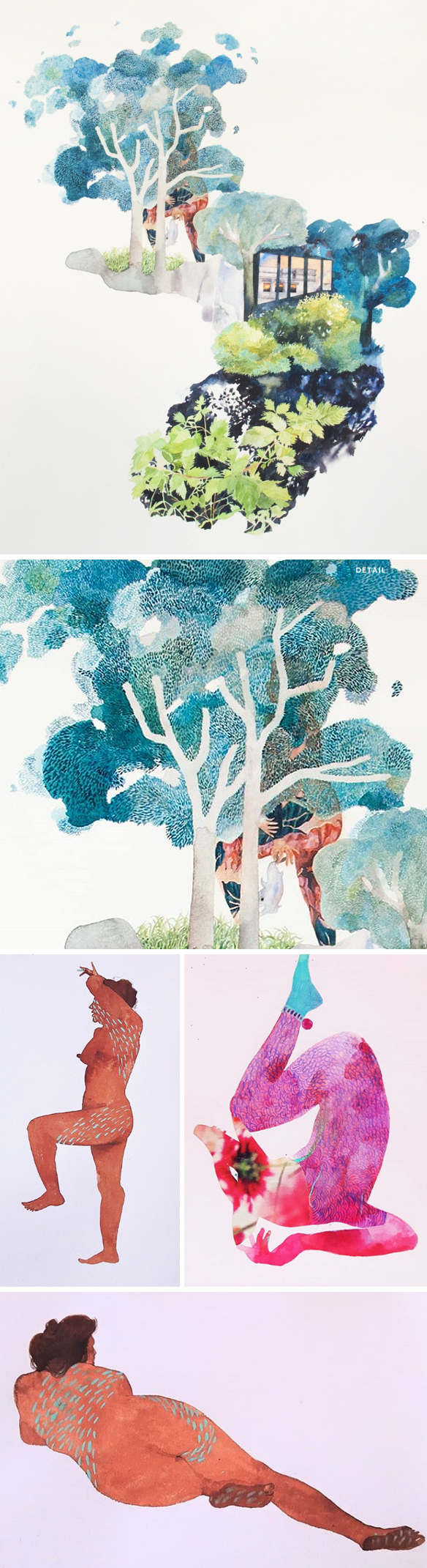
Gasp! Those figures?! Stunning. And finally, I couldn’t wrap up this post without a little look into Sara’s home studio. Ahhh, sunshine streaming in… see, it doesn’t rain in Vancouver all the time:

When there’s stuff all over the floor, you know some major work is getting done! Thanks so much to Sara for being my very first guest of this new season … and congratulations on your big news, Sara xo. Thanks to Saatchi Art and Create Magazine for supporting the episode, and thank YOU for swinging back over for a whole new season! There will be more art for your ear next weekend.

Other links:

  1. Pennylane Shen, Art Advisor Extraordinaire 
  2. Vancouver Mural Festival
  3. Thrive 
  4. Video of Sara’s mural by Joe Bronson  {Joe Bronson’s IG}
  5. The Other Art Fair presented by Saatchi Art


paul sibuet

I saw the work of French artist Paul Sibuet when I was in Venice this past June. I stood in front of his work for ages {at Bel-Air Fine Art}, taking in all of the perfectly white details, and of course the cascading “paint”. This “flow” series includes tributes to several historical artists – from Pollock to Mondrian, Warhol to Klein. Oh, and also, I want to touch all of those little tubes of paint, the bottles, cans … ALL OF IT.


christine kim

Now this is some mixed media… and all of it is exquisite! Drawing, painting, and that paper-cutting!? Oh my word. This is the gorgeous work of Toronto based artist Christine Kim. Honestly, I don’t know what else to say… I’m too busy staring at that paper lace.

{via Thrive’s Instagram feed}


richard holland

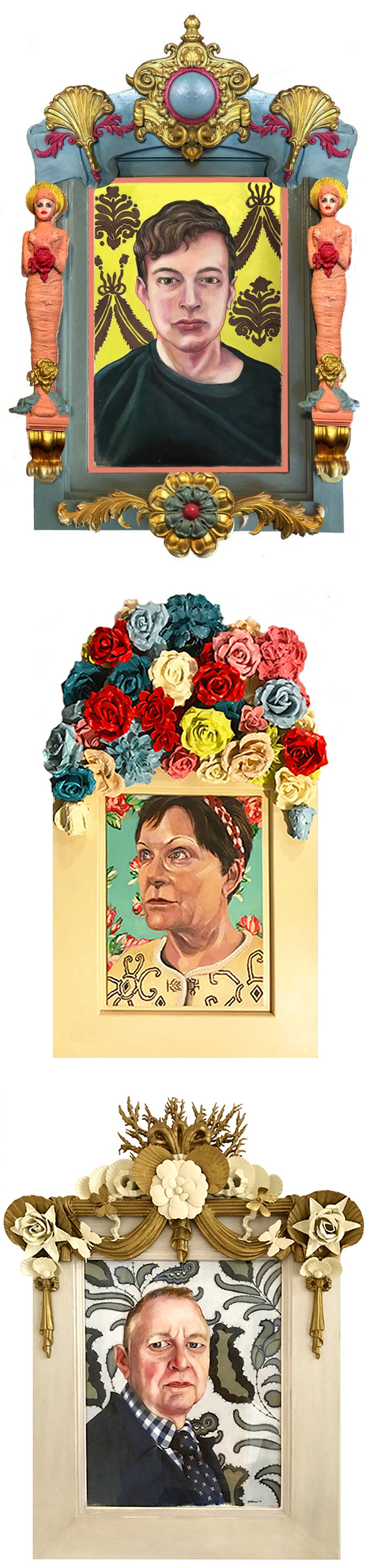
Alright, we all know I’m a sucker for portraits … but then add these ornate, ceramic / found object covered frames and I’m all in! This is the work of California based artist Richard Holland, and yes, those frames are just as intentional as the portraits themselves:

“I collect objects of interest and build them myself if I cannot find them. My frames are as important to me as my paintings, they are all one, an equal part of each other. The frame is not random, it represents the character of who I paint or has something special that connects and is representative to that person. The portrait and frame exudes character and story with it’s unique look, feel and attention to dimensional detail.”

Lovely. Oh, and, that happens to be a self-portrait of Richard just above these words.


fiona ackerman

So here’s the thing… these collages are not collages, they are paintings of collages. Yep. This is the exquisite work of Vancouver based painter Fiona Ackerman. Here’s the other thing. Fiona is so prolific, that you really have to pay attention to what she’s doing, otherwise you might miss an absolutely gorgeous series … like this one, titled “Glasslands”:

“[This series] looks at the garden as both a reflection of the natural world, and an artificial construction. According to Foucault’s concept of Heterotopia, a garden is an other place where the true wild is reflected but subversively controlled. It both imitates and contests reality by simultaneously presenting a wild environment and its opposite, an orchestrated performance of nature, a choreography of growth. 

These paintings [26 in total] emerged from a process of exploration beginning with pieces of painted paper cut in shapes of foliage, placed inside a mirror box (hence, glass-land). The resulting three-dimensional mirrored images shatter, amplify and disrupt conventional views of nature rendered on a flat surface, giving rise to lush compositions with depth and unexpected juxtapositions. In this restrained inventory of sources, the artificiality of the parts contrasted with recognizable flashes of leaves, branches, blades of grass. Though painting, reflection becomes invention.”

Cut shapes in a mirror box? Oh my word, that’s another other thing! Love.


shannon d. taylor

First, if you have a kimono like that, yes, drop everything and paint a self-portrait! Second, in reference to that block ‘o butter: “Yep, that’s a stick of butter. I make no apologies.” Hahaha! That’s a direct quote from the Instagram feed of California based artist Shannon D. Taylor. I love everything in Shannon’s weird and whimsical portfolio … is it any surprise that she also spends some of her time as the Director of Art and Restoration at Children’s Fairyland in Oakland? No, not at all. {ps. she also happens to be a professor in the Illustration Program at the California College of the Arts. Renaissance woman!} 
ps. Speaking of Fairyland, on Sept 28th {6 – 9pm} “Drawn Together” will be happening for the sixth year in a row! Tickets are now available for this magical evening of art, food, drink… and fairies! All of the ins and outs can be found right here.


valeska soares

Yes, I LOVE this. “Doubleface” is the latest series by Brazilian born, New York based artist Valeska Soares. Vintage paintings reversed, re-stretched (I assume), painted, and cut. She says, “these portraits are about creating a relationship with these women – about the history of portraiture, oil painting and abstraction.” Obviously I love the little peek we get of the portraits, but I also love the way Valeska has titled them… each piece named after the paint color featured. For example, the pieces above (from top to bottom) are :  “Nickel Titanium Yellow/Permanent Green”, “Gris de Payne”, “Turquoise Blue”, “Sap Green”, “Deep Cadmium Red”, and “Indian Red/Ivory Black”. Sigh. Here’s to a weekend filled with thrift shops and paint stores!

{Her work is on the cover of the September issue of Frieze.}


Testez les jeux en ligne casino les plus populaires du moment et plongez dans un univers de gains potentiels, d’action continue, de graphismes modernes et d’ambiance réaliste.