Well, I just found my new weekend wardrobe! These lovely oil paintings on paper are the work of American artist Sophie Treppendahl. They’re part of a series titled, “Clothes I Like Owned by People I Like”. I like them too! These jeans, shirts, and hats are hanging with a bunch of their stripy, patterned friends in Sophie’s solo show at Studio Allston Hotel in Boston, opening in August.
![]() |
![]() |
![]() |
![]() |
![]() |
![]() ![]() ![]() ![]() ![]() ![]() ![]() ![]() ![]() ![]() ![]() |
![]() |
![]() |
![]() |


So, so, so smart! UK – now California based – artist Anthony Zinonos was one of the first collage artists I started following way back when. I was instantly grabbed by his sense of humor, ridiculously amazing use of colorful negative space, and his full-on ownership of ‘less being more’. Anthony was guest number TWO on my podcast, and it’s still one of my favorite episodes. May I suggest pulling a chair out into the sun and giving it a listen? We cover everything from UHU glue sticks to getting arrested. Seriously.
ps. I’m the keynote speaker at KolajFest in New Orleans TOMORROW NIGHT, and I feel like I owe my love of collage {and the way I’ve finally embraced my own collage work} to Anthony… because hey, “If it buckles, it buckles.”

I thought I was obsessed with color, but Minnesota based artist Josie Lewis takes this passion to a whole new level. These are just two of her more recent pieces, but she’s got a portfolio filled with bits of paper, paint, resin, and mesmerizing videos demonstrating how she makes it happen… yep, there goes your next couple of hours! Happy Monday…

Oooh, paper rocks! I really want to make a joke about scissors, but I won’t. This lovely piece is the work of California based printmaker Mark Johnsen. I wonder how long I would stand in front of this work, titled “The Rocks”, if given the opportunity. Monotypes, etchings, stone lithographs … oh so many textures, lines, details. Sigh. Here are a few words on where Mark draws inspiration:
“… from childhood fishing trips to the Eastern Sierras and is fascinated by the intersection of natural elements. By using the Monotype process he works reductively to scratch or wipe away extra information to reveal a clearer image. Much like his memories, the process caters to the images that are produced.”

The term “mixed media” is a massive understatement for the work of American artist Kaylee Dalton. You’re looking at paint, wax, fabric, bits of watercolor paintings, gouache, and probably a bunch of other stuff! I just discovered Kaylee’s work a few months ago, and yes, I was an instant fan. Listen right up there under “Midnight Lush No.5”, or you can subscribe on iTunes.
First… the way I found Kaylee’s work? She submitted to the issue of Create Magazine that I curated. Not only did I select her work for the issue, I also chose her for the cover:
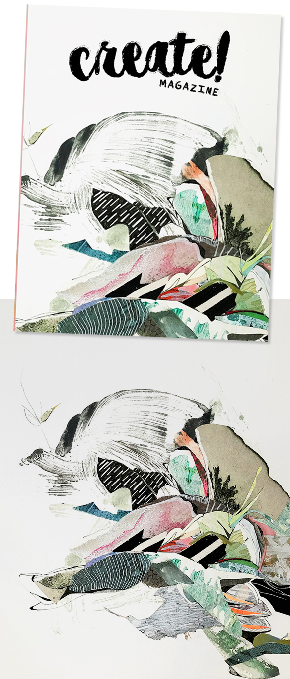
Gorgeous!
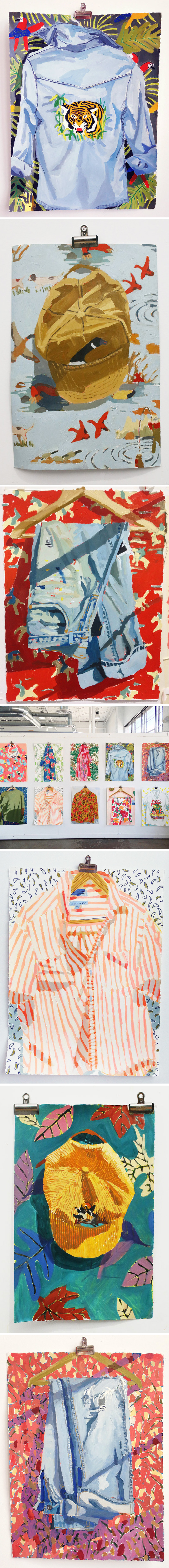
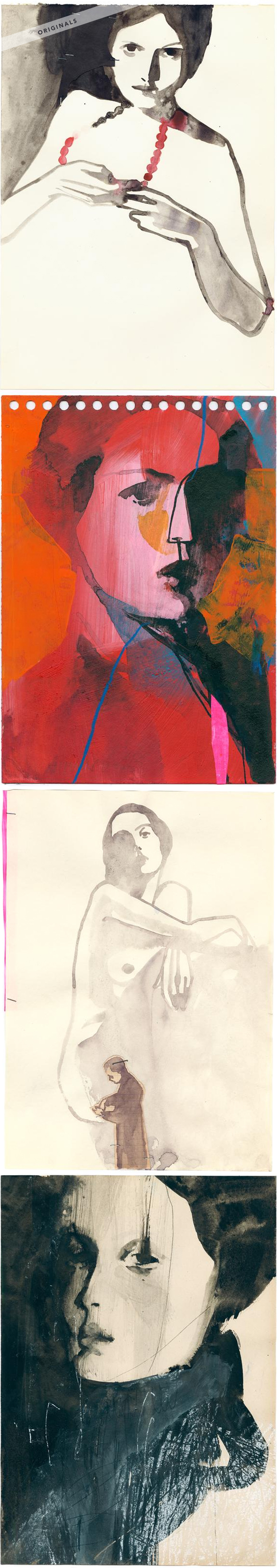
So, I mentioned that I basically stopped in my tracks and wrote about her the second I saw her submission – here are a few of the encaustic monotype / mixed media pieces I included in that post:
Oh my word, I love them all. As you can see, I had a really hard time deciding if my faves were on the white Rives BFK paper, or the black Stonehenge… and I still don’t know!?
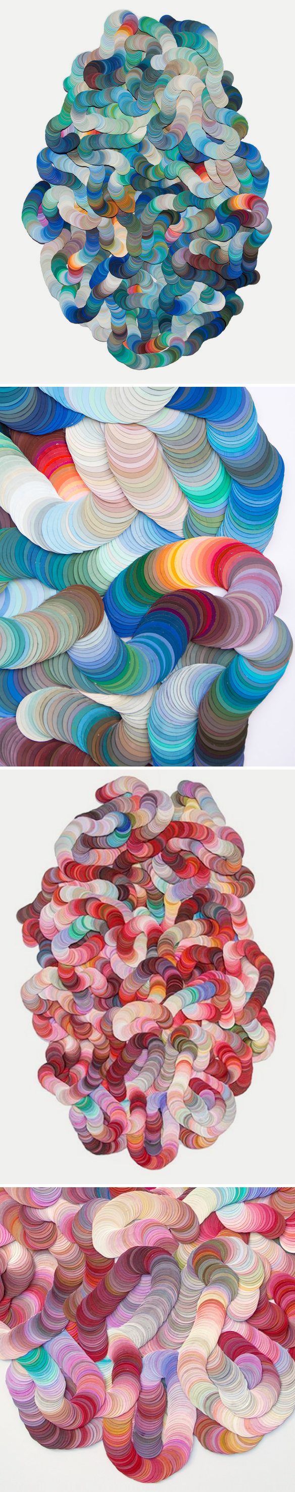
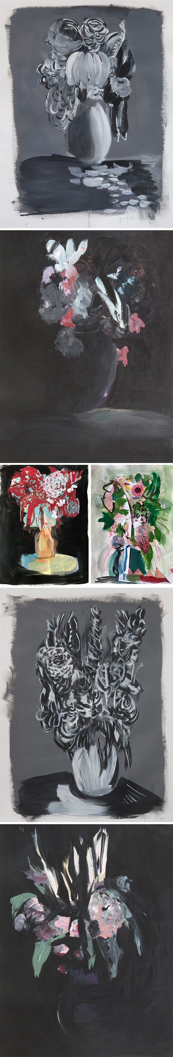
Next, Kaylee’s encaustic paintings on peg board panels. This is what she was working on up until last year:
You can see the seeds {pun absolutely intended} for the work she’s doing now, yes?
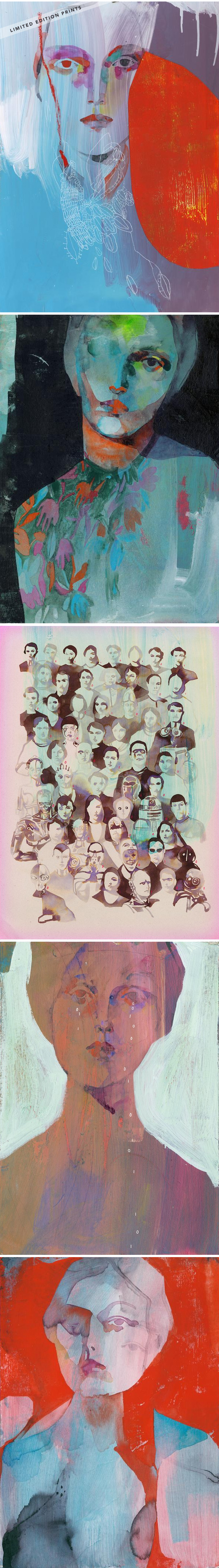
Ooh, and if I wasn’t having a hard enough time deciding between the black / white paper backgrounds, she recently started playing with Kraft paper … or in her words, coffee ice cream paper:
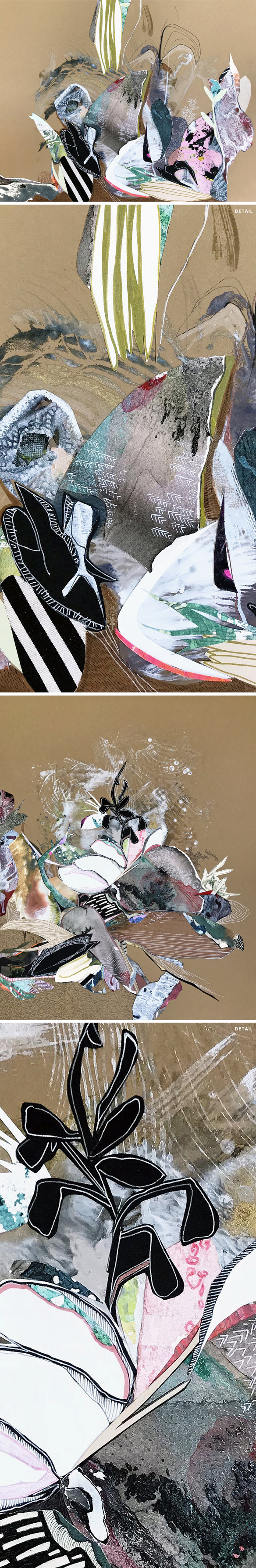
Mmmm, coffee ice cream indeed! See, wouldn’t ALL of her new work be gorgeous as fabric? Hey Gucci, I’m talking to you!
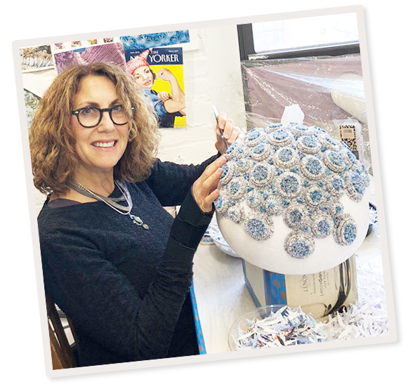
And finally, Kaylee in her studio and one lovely work in progress {both found on her Instagram feed}:
Beautiful. Thanks so much to Kaylee for coming on the podcast … gushing aside, I really do think there are exciting things in her future! Thank you to Saatchi Art for supporting the episode, and thanks to you for listening. There will be more Art For Your Ear next weekend.
Other links:
- Kaylee on Instagram
- Create! Magazine
- Ball State University, Indiana
- Kris Knight, Artist
- Gucci
- Frank Stella, Artist
- “Kitchen Nightmares”
- Milk Bar Bakery, New York
ps. I just got a message from Caitlin McDonagh, and she suggested Krylon Archival Varnish spray for sealing work. I’m going to try it this afternoon! – Thanks Caitlin

I mean, WHAT!? A cut paper collage that has taken over a beautiful old space… love, gasp, whoa, sigh … all the stuff I say when I’m madly in love with a project. This is the work of Berlin based artist Clare Celeste Börsch. I’ve written about her collages before, and even have one hanging in my house, but this…. THIS? It is an installation titled, Intimate Immensity … Love, gasp, whoa, sigh. And oh yes, I’m trying to get her on the podcast as we speak!
ps. some of Clare’s prints are for sale in her shop.

……………………………………………………………………………………………………………………………………….
Oh, yes! For years, I’ve been madly in love with the daily drawings of German artist Tina Berning. That said, there was no easy way to buy one of those lovely, layered, mysterious pieces … until now! That’s right, Tina has finally set up an online shop. She has a selection of originals available {the first four in this post are just some of my faves}, but that’s not all… she has also done a limited edition print run on five of her pieces {the final five beauties above. ps. I got the bottom-most image, titled “Undo” ♥ } Pop over there soon because they are going fast.
ps. Tina was my podcast guest on episode no.68… such a good one! Look/listen right here.

Flowers at nighttime on paper … sigh. This is the dreamy/eery work of Brooklyn based artist Jenn Dierdorf. I love her palettes, loose strokes, and don’t even get me started on those grey-scale bouquets. I discovered Jenn’s work because we’re in a group show together! Yep, the lovely and talented artist/curator Kirstin Lamb assembled a show, titled “Bouquet”, that is currently hanging at The Yard in Williamsburg, Brooklyn. The opening party is on April 18th {5:30-8pm}, so if you’d like to come and see a whole bunch of flower-inspired works by ten flower-loving artists, then RSVP right here.

Oh my goodness, how gorgeous is that? The first time I wrote about Swedish artist/illustrator Stina Persson was way back in 2010. That’s insane. So, here we are eight years later speaking to each other for the very first time… and I asked her everything! I found out that she studied fashion in Italy, then illustration at Pratt in New York, and eventually found her way back to Sweden to become a successful illustrator/artist {and mother of three sons}. I also asked her if Swedish people actually shop at IKEA. They do. Listen right up there under that beautiful ink ‘n cut paper piece, or you can subscribe on iTunes.
Let’s start with a few inky, washy, fashiony pieces that pop to mind when I think of “Stina Persson”:
Ooh la la… rich vintage glam! Now, you know how I feel about collage, right? Well look at these cut paper pieces that blend Stina’s inky strokes with colorful bits of paper:
Stunning, and an excellent segue into some of Stina’s very high profile commercial illustration work:
And that is just the tip of a huge illustration iceberg!
Now, not only does Stina make spilled nail polish look delicious, look what she does with lettering {ps. beware of killer kittens}:
Gorgeous (and note the beautifully buckled paper). Well, let’s up the ante, shall we? These videos of Stina in action, found on her Instagram feed, are absolutely mesmerizing… and a little Beyonce quote never hurt either:
Seriously, I could watch those on repeat all day loooooooong. But I won’t, because now it’s time to show you this gem:
Dreamy and, oh, so beautifully bizarre. This is a promotional video Stina worked on for a single, titled “Left For Dead”, by RABBII.
And finally, Stina herself:
Ah, I always love seeing the artist doing what they do. Thank you so much to Stina for taking the time to do this with me; thanks to Saatchi Art for supporting the episode; and big high fives to YOU for listening. There will be more Art For Your Ear next weekend.
Other links:
- Stina on Instagram
- Stina’s Online Shop
- Stina’s Illustration Agents {UK, NYC, Japan, Sweden, Australia/NZ}
- Pratt Institute, NY
- Hey, fancy white-walled galleries… call her to put on a big, beautiful show!

Does your junk mail look like this?! Nope, neither does mine! These gorgeous, textured, papery sculptures are the work of Brooklyn based artist Jaynie Crimmins. Here is how and why she does what she does:
“My medium is the proliferation of promotional mailings from government representatives, non-profit and political organizations in addition to consumerist advertising and bills. I shred these mailings to generate elements that are uniform in size, assigning equal importance to all the shreds. I then subject them to a rigorous practice of separating colors, rolling or sewing the shreds and commingling specific mailings.
The fragments, past the point of re-assemblage, still reveal bits of text, imagery, envelopes, and colors; traces of their cultural origins. Once a means of direct communication, my manipulation of these materials obscure their messages to promote my own.”
Brilliant. And, clearly, I have to finish the post with an image of Jaynie in action:
Craziness. Happy Friday.
