“it began with biscuits”

joelpenkman1

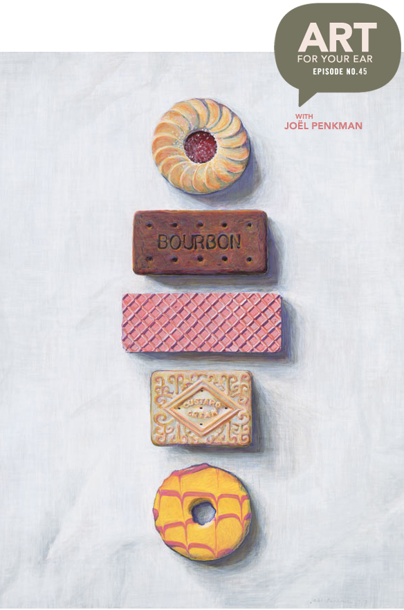
It really did begin with biscuits… in 2009 with those biscuits right up there to be exact. I’m talking to New Zealand born, UK based painter Joël Penkman. Her food paintings are absolutely stunning, but imagine my delight when I found out that they’re actually painted with food too… well, kinda. How’s that for a tease?! You can listen right up there under the tower of cookies, or subscribe on iTunes. First up, her gorgeous {and very popular} ice creams:

joelpenkman2

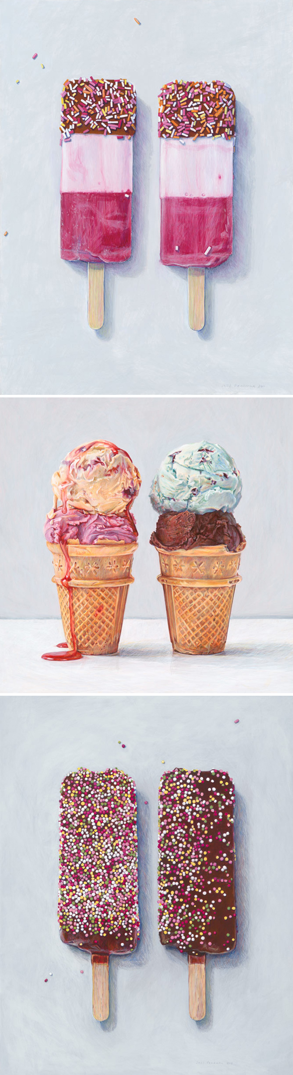
See? Yeah, that’s why they’re so popular! Up next, the rainbow of lollipops she painted for my Land of Nod collection last year:

joelpenkman3

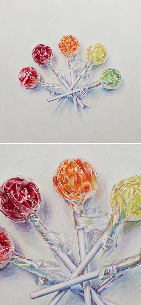
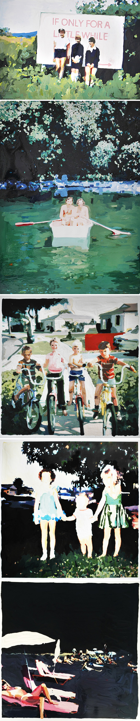
So sweet… literally! Sorry. I had to. Ok, moving on. Here are just a few of my favorite pieces from her Taste of America book. There are over 100 to choose from so you can see my dilemma:

joelpenkman4

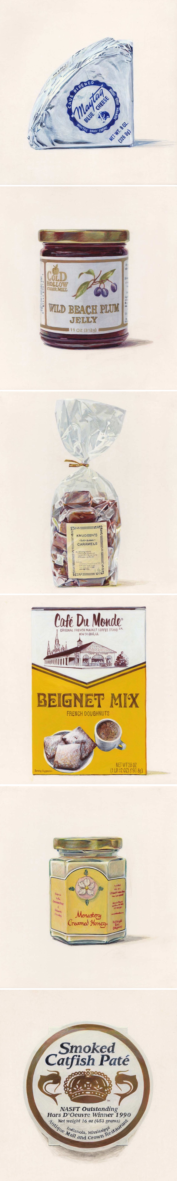
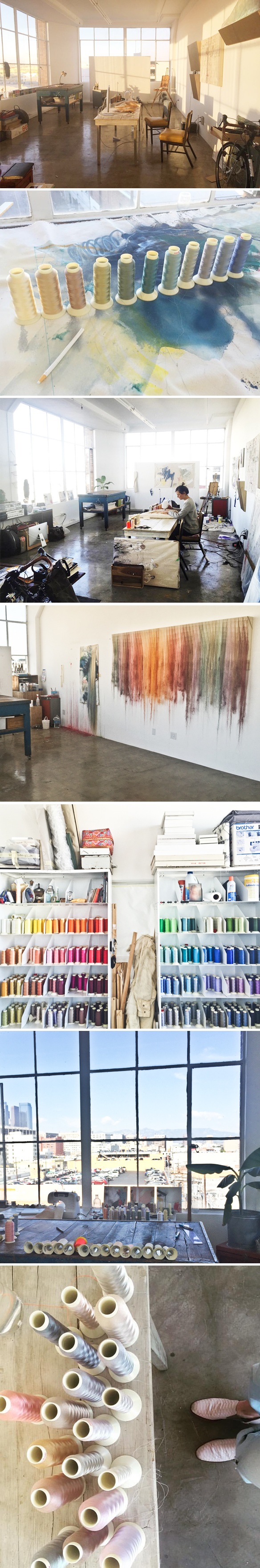
Ah, smoked catfish paté… yum. Ok, from cheese, jelly and caramels to her very tidy studio {she wasn’t kidding}:

joelpenkman5

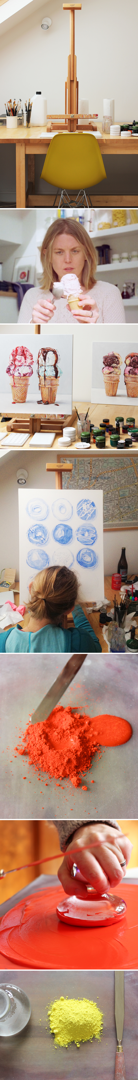
… and her pigments! Her process and use of homemade egg tempera kinda blew my mind. I had no idea what it was or how to do it. I have always loved her work, but now seeing how she actually makes that work… well, I am totally, completely, head over heels in love. I also love that she photographs her own subjects as well {hence the photo of her mid-scoop}.

So, she paints a lot of food because she’s very good at it, therefore lots of people ask her to keep painting food. I asked what a few of her favorite pieces were, and it turns out, they’re not food:

joelpenkman6

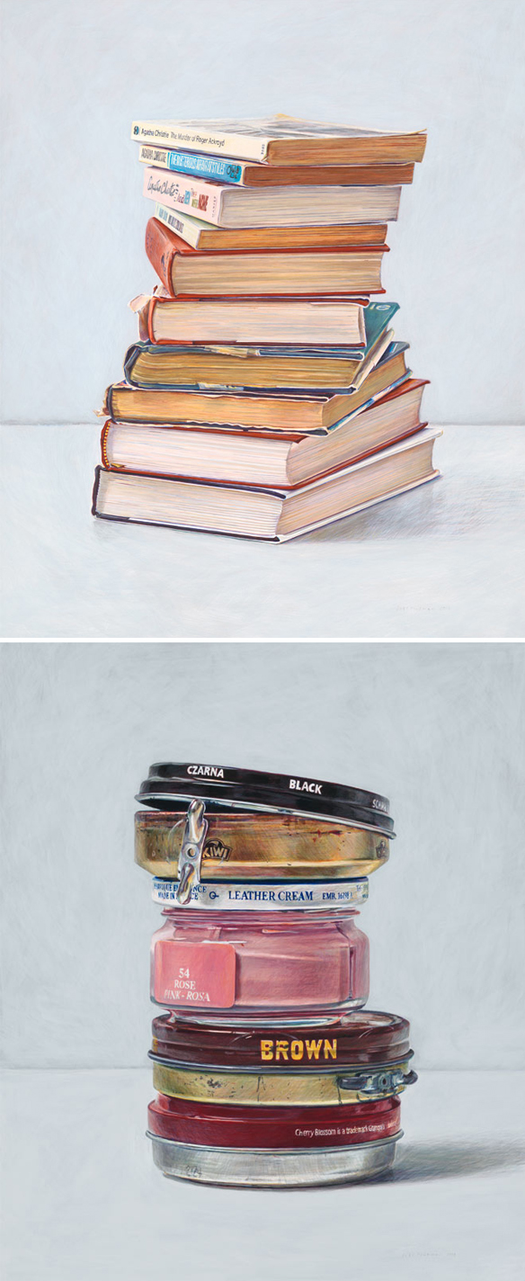
Books and the most beautiful stack of shoe polish I’ve ever seen. Well, if she gets to show her favorites, I want a turn too:

joelpenkman7

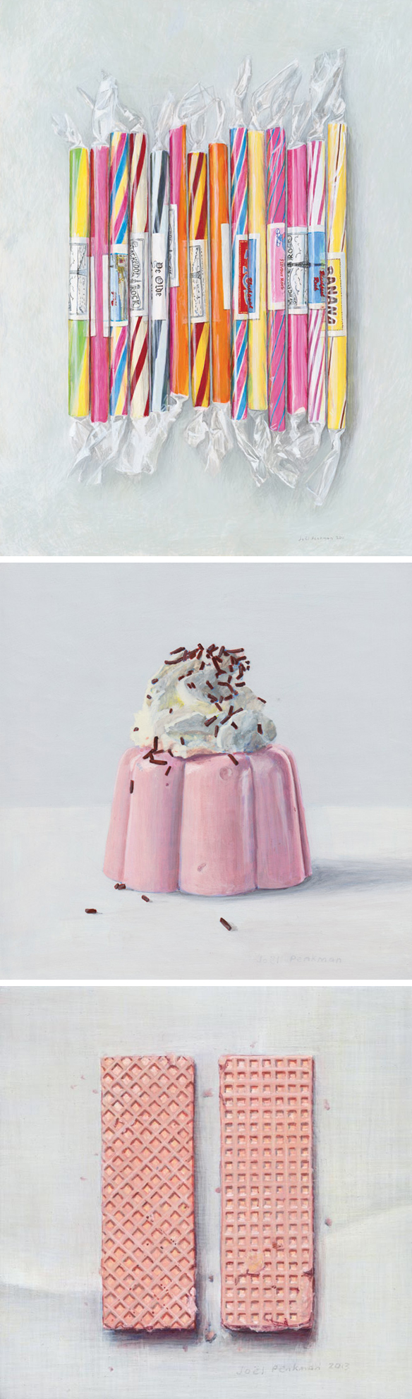
Beautiful, and oh so delicious. I also thought it was fitting to end with biscuits since that’s where we started. Ok, now, before you go, you HAVE to watch this video of Joël in action. First of all it’s hilarious, and secondly it’s very educational. Wait till you see her actually squirt the egg yolk into her finely ground pigment. Oh yes, and there’s a talking chicken and a 3-piece band in there too:

I want a band in my backyard while I pick rhubarb! And on that note, I’ll say thanks so much to Joël for doing this with me, thanks to Saatchi Art for supporting yet another episode, and HUGE thanks to you for listening … there will be more art for your ear next weekend.

Other links:

  1. Design*Sponge
  2. Handsome Frank Illustration Agency
  3. Joël’s prints available here


hope gangloff

hopegangloff

Books, wine, art, music, and fantastic clothes. Yep, I want to be friends with all of these women. This is the beautifully composed, colorful, pattern-filled work of New York based artist Hope Gangloff. Sigh… wouldn’t it be great to hang out in these paintings for the weekend? I want a red pedicure… and a fish blanket.

{via Fresh Paint Magazine}


rebekka connelly

rebekkaconnelly

Paintings? Not really. Each of these is a one of a kind stencil print, printed with acrylic on cotton paper. They are the work of American artist Rebekka Connelly, and I loved them the second I saw them. I think I loved them even more after hearing this though:

“For many years, I worked as an illustrator and Product Design Director for a boutique stationery company called Snow & Graham. After staying home with my kids for a few years, I am finding time again to create and define my process. It feels great to put pen to paper again.”

Amen.


scott sueme

SCOTT_SUEME

I don’t write about abstract paintings very often, but when I saw the most recent work of Vancouver based artist Scott Sueme, well, I couldn’t help myself. His palette, the graphic compositions, and let’s be honest… those stripes pulled me right in. All of these pieces are from his upcoming show, titled Retreat, that opens at Kimoto Gallery this Friday, April 8th in Vancouver. Retreat indeed… looking at these paintings makes me want to pack my bags in search of summer.


sara landeta

SaraLandeta

Beautifully drawn birds on the back of old drug boxes. LOVE. This series, titled “MEDICINE AS METAPHOR” is the work of Spanish artist Sara Landeta. Here is her description of this work:

The project includes a collection of 120 boxes of drugs that have been consumed by different patients to overcome their illnesses. All boxes are illustrated inside with a broad classification of birds from different families, being the only animal that although it gives it a meaning of freedom, because it is the only one able to connect with the earth and the sky, is also one of the main animals in captivity. This juxtaposition of the natural and the synthetic interprets the patient as a captive animal, and the bird as its metaphor.
Draw a collection of birds inside these boxes holding a single reflection ; l will learn to be birds in captivity, but they are wanting to fly, and that is what keeps them alive. 

Lovely. But sad.


lorna simpson

lornasimpson

Oh. Lorna Simpson. Her hair collages make my collage-loving heart skip a beat … brilliant, beautiful, and this time a little bit rocky. These pieces are part of a series of 12, exclusive to Vogue.com. Here is Vogue’s description of this fantastic work:

Now, her subjects are more liberated than ever… in a new exclusive series for Vogue.com, Simpson has lifted the faces of 12 women from “very mundane” ’60s and ’70s advertisements in Ebony magazine—the culture and politics monthly she grew up with that “informed my sense of thinking about being black in America”—and paired them with illustrations of geological and astrological forms from a 1931 textbook. Stripped of any fundamental context, the women provide no origin story and no identifying characteristics. The geometric shapes replacing their hair weren’t chosen for their resemblance to, say, Nefertiti’s crown or Erykah Badu’s emerald head wrap—references that may spring to mind as you look at them—but rather for the same reason you might cut, color, or change the texture of your hair: simply because, says Simpson, “I thought they were beautiful.”

Sigh… I do too.


“nothing is a mistake”

nike1

Time-consuming, candy-hued, magical. That’s what comes to mind when I think of the work of this artist. Today I’m talking to LA based German artist Nike (pronounced Nee-ka) Schroeder… I have to add that because for years I thought her name was Nike… like, you know, Nike. It’s not. It’s Nike (Nee-ka). Ok, now that that’s out of the way, we can talk about her absolutely stunning work. Miles and miles of thread, porcelain, sometimes a bit of paint, and more thread. You can listen right up there, or subscribe on iTunes

First things first… one of my faves… this installation, titled 34°North 118°West :

nike2

Ah-mazing… and the photos don’t even close to do her work justice. I’ve seen them in person and they’re so so so beautiful. The way they move in the slightest of breezes… magical. Next, these pieces are from an older series, titled Fundamental Reports. This is what she was making when I first wrote about her work in 2012:

nike3

You can tell she reallllly wanted to start playing with that dangly thread! Speaking of which, this is the custom piece she made for interior designer/stylist Emily Henderson… here’s the installation of this colorful, ten foot beauty:

nike4

Ah! And there it is featured in Domino Magazine… not too shabby! I want to take full credit for this piece, because I introduced Emily to Nike’s work. Yep, this love affair started at The Fig House – a gorgeous event space in LA that Emily designed. She asked me to curate the art, and Nike was one of the ten artists I chose. Match. Maker. Just sayin’.

Next up, Nike’s latest show where she went back to some of her figurative work… this time with paint… porcelain, and of course, THREAD. This was shown with her primary gallery in LA, Walter Maciel Gallery:

nike5

So. Good. And now, brace yourself… Nike’s amazing, light-filled, downtown LA studio:

nike6

So. Much. Thread! And those windows {and of course, those great shoes}. Oh. Such beautiful work, and another episode that I loved. It never fails… in every single episode there is a moment when I get chills, and when Nike said “nothing is a mistake”  – that those layers and layers gives your work depth and wisdom because they have learned – yep I had a little shudder of excitement. Sigh. And with that, I will thanks to Nike for doing this with me, thanks to Saatchi Art for supporting the episode, and as always thanks to you for listening. There will be more art for your ear next week.

Other links: Jack Fischer Gallery


lisa golightly

lisagolightly

Oh. My. Goodness. This recent series from Portland based painter Lisa Golightly is killing me. That black beach? That little bike gang? Gorgeous! Not acrylic, or gouache or oil… nope, it’s house paint. Kinda perfect considering how homey her work is. As always, Lisa’s paintings bring back the sweetest, sometimes slightly faded, memories of childhood. Sigh… they make me feel like I’m eight again… “if only for a little while.”

Lisa will be showing several of these pieces at LA’s Good Eye Gallery. The opening reception is on Saturday April 9th, 5-9pm… and ps, a little birdie told me that Lisa is coming in from Portland for the party! For more information contact 323 255-4538 or info@goodeyegallery.com


what goes around … at nahcotta

nahcotta_show

Oh! Get it… oh… circles… anyway. These are 7 of 34 pieces in Nahcotta‘s latest exhibition, “What Goes Around”.  Yes, 34 artists – many of whom I’m slightly obsessed with – have created 12″ circular pieces of art. From Jeremy Miranda, to Jennifer Davis, to Leah Giberson {who hinted about this piece during our podcast interview a few weeks ago} – the roster is just fantastic! This was the inspiration for the show:

Choosing a particular selection of 34 artists, predominantly from the gallery’s significant stable, Nahcotta challenged them with the task of creating work on a twelve-inch circular panel. Since Greek antiquity and making resurgence throughout the Renaissance, circular works of art, called “tondi” (“tondo” when singular) have been made in architecture, sculpture, and paint. Botticelli and Michelangelo, for example, both painted and sculpted more than a few scenes utilizing this form. Deriving from the Italian word “rotondo,” meaning “round,” the shape very much informs the context and narrative of the art itself, so “What Goes Around” promises an incredible range of work launching from the same dimensional foundation.

It’s a gorgeous show, so if you can make it to the artist reception/opening – which is TOMORROW from 5-8pm – well, you should! It will be up from April 1 until May 1, 110 Congress Street, Portsmouth, New Hampshire. Now, if you can’t make it to the show, all of these pieces are available for purchase online… but hurry because a few of them are already SOLD.

{Artists shown above: Jeremy Miranda / Timothy Wilson / Michelle Morin / Travis Hetman / Jennifer Davis / Laura Berger / Leah Giberson}


conrad jon godly

conradjgodly

I really want to touch these oil paintings. But I won’t. This is the stunning work of Swiss artist Conrad  Jon Godly. Perhaps it’s the Canadian in me, but majestic snowy mountains will always have a special place in my heart, and I absolutely love the way he’s captured them in paint… thick, dripping paint. Gorgeous.


Akıllı Hayat İstanbul